Believe it or not, a presentation can make or break a sales meeting. Oftentimes, sales teams will use a presentation to help communicate key features, benefits, and the value proposition of the offering. A sales pitch presentation helps grab the audience's attention, create interest in the product or service, address their pain points, and ultimately convince them to make a buying decision. It acts as a tangible resource for interested buyers to learn more about a company’s offering and how it will benefit their team.
A good sales deck presentation enables sales teams to put their best foot forward in a meeting and gets them one step closer to closing the deal. A bad one can turn the prospect off to the company entirely.
When creating a sales deck, it's crucial to avoid common pitfalls that can hinder its effectiveness. Here are some sales deck deal-breakers to steer clear of.
Overloading with information
If a prospect agrees to a sales meeting, they’re likely already interested in what you have to offer but need more information to make that final decision. While information is important, over delivering can easily overwhelm the buyer and have a reverse effect. If they leave the meeting with more questions than answers due to information overload, they may be less inclined to move forward.
In a sales deck every slide should be intentional. Avoid cramming too much information onto each slide and keep the message clear and concise. This allows the audience to process and retain what you’re telling them, so they can make an informed decision later.
Inconsistent branding
Too often we hear marketing teams complaining about the decks their salespeople are using in meetings. They tend to be cluttered, inconsistent, and off-brand— or Frankendecks, as we like to call them. Any company presentation should be an extension of the brand, but it’s especially important when you’re pitching your company to potential clients. Inconsistent branding in a sales deck lacks brand identity and reliability, and compromises the trust of the prospect.
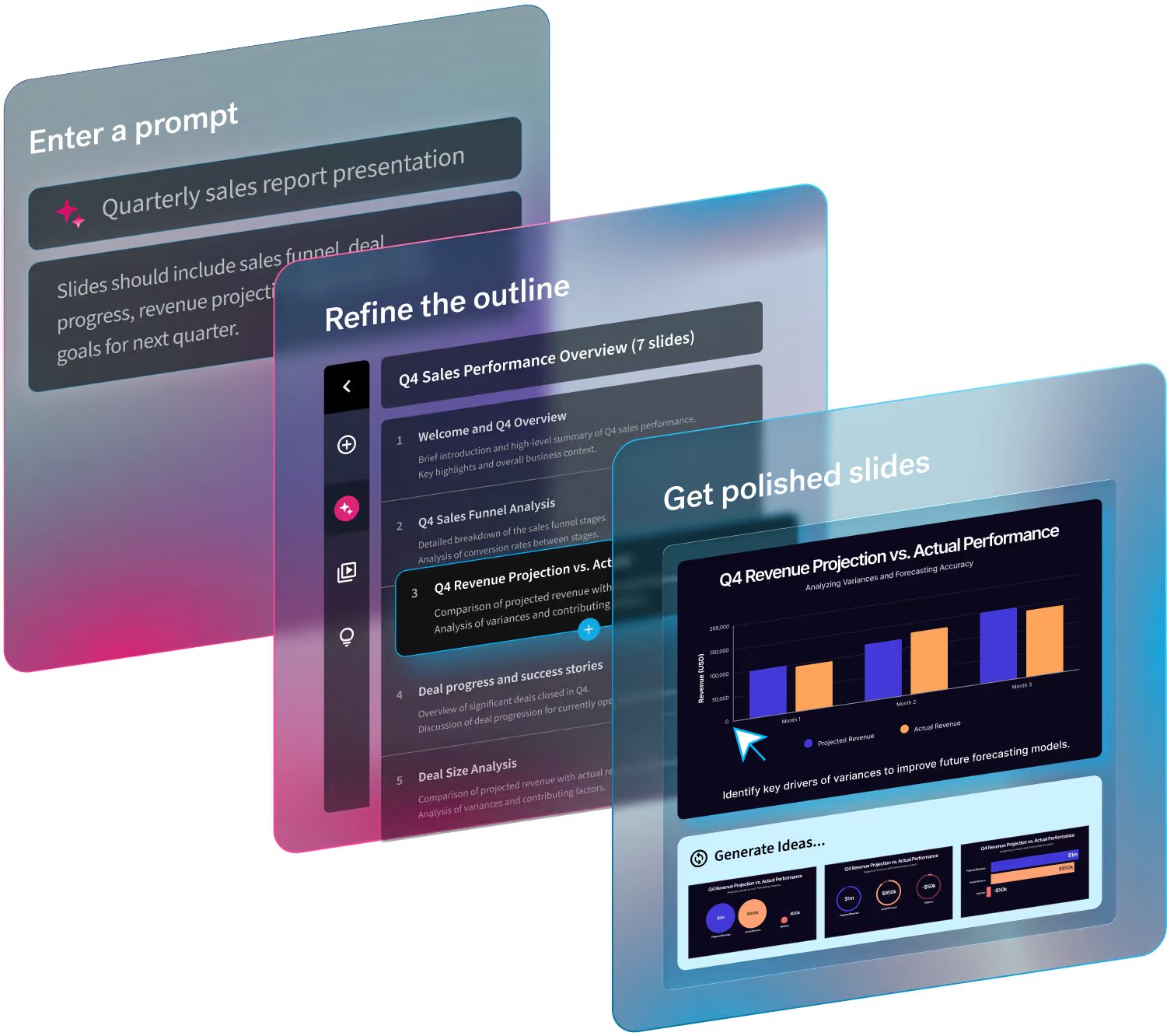
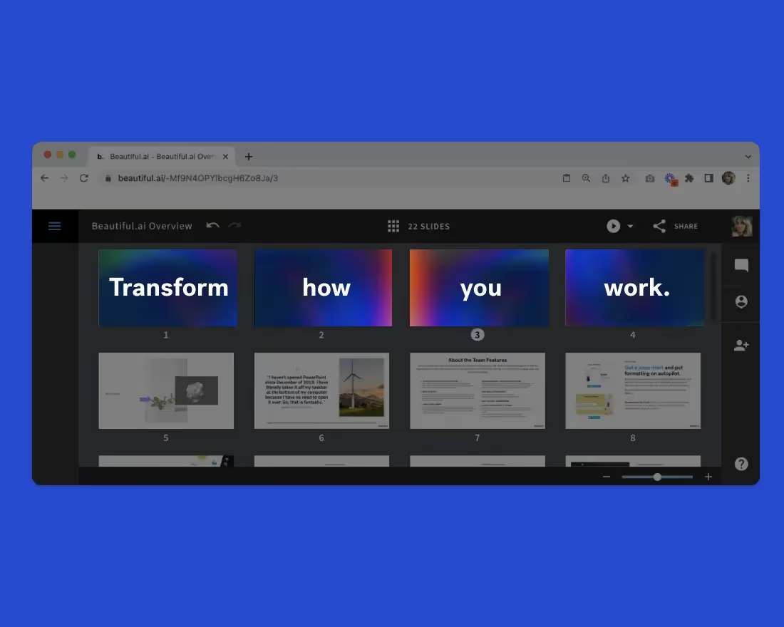
Beautiful.ai’s intuitive and collaborative presentation software lets your sales team create professional branded sales collateral in a fraction of the time. No designers, no formatting, just beautiful presentations to keep your sales team ahead of the competition.
Lack of clear structure
Nobody wants whiplash from a meeting that lacks structure. Not only does that cause a disconnect between the presenter and the audience, it can cause your prospect to disengage from mental fatigue. The same applies to a presentation without a clear flow. Are they tracking your content or did you lose them along the way?
Your sales deck should lead the audience through a story, from their unique problem to the solution you’re offering, and end with a strong call-to-action. Choosing the right charts, graphs, and slides can help you organize your pitch in a way that feels natural and makes sense to potential clients.
Neglecting audience needs
At the end of the day a sales meeting is about the buyer. Each sales deck should be tailored specifically to the unique needs of the audience. If you’re neglecting the needs, or pain points, of the prospect they may end up missing the value of your offering entirely.
When building your sales deck, don't focus solely on your company and its products. Instead, address the audience's pain points, challenges, and how your solutions can benefit them. If you’re including a demo, consider their use cases and incorporate them into your pitch.
Too many bullet points
You’ve probably heard of “death by PowerPoint” which refers to the severe boredom caused by a bad presentation. This is generally a result of too much text on the screen. Your prospect isn’t agreeing to read a novel when they take a meeting with your sales team. And if you’re expecting them to learn about your value proposition by reading lengthy blocks of text, you’re doing yourself a disservice.
Steer clear of excessive bullet points or text boxes in a sales deck. Instead, use dynamic visuals, charts, and infographics to convey key information in a more engaging way.
Failure to highlight unique value proposition
The value proposition is the heart of your pitch. It’s what differentiates you from other companies in the space, and it’s what will make their life easier if they adopt your product or service. If this isn’t apparent at the end of your presentation, you could very well lose the deal. If they can’t find the value in your offering, why would they buy? Make sure your unique value proposition is clearly communicated throughout the sales deck so that next steps feel like a no-brainer for the decision-maker.
Sloppy design
If you wouldn’t show up to a sales meeting in your pajamas, you shouldn’t show up with a sloppy deck, either. If your presentation is anything less than buttoned up, it could be a turn off. Sloppy presentation design can be anything from color choices, fonts, and images to the slide layout.
Bad presentation design may be one of the biggest red-flags when creating a sales deck, but luckily it’s an easy fix. Beautiful.ai’s sales pitch presentation template can give sales teams the tools they need to stand out from the competition and wow prospects with a professional deck. The customizable template has everything sales professionals need to stay organized in their pitch and win more business.
Not addressing objections
Most prospects will have questions and objections before they’re ready to bite the bullet. If you fail to address those, they might leave the meetings with doubts and turn to a competitor instead. Leaving questions on the table is a huge miss for sales teams, but one that can be easily avoided. Anticipate and address potential objections within the sales deck. This shows that you understand the concerns of your audience and value their time and money.
Omitting clear call-to-action
You’ve put all this effort into your sales pitch, now it’s time to close the deal. If you forget to include a clear call-to-action, the relationship with your prospect may fizzle. Where do you go from here to keep the momentum going? Every sales deck should have a clear call-to-action at the end. Whether it's scheduling a demo, signing up for a trial, or making a purchase, the next steps should be evident to both parties involved.
Pro tip: you can send your sales deck presentation as a follow up resource in an email and use that as an opportunity to reintroduce the CTA after the meeting.


.avif)

.avif)
