Pantone— known for introducing the Pantone Matching System to identify and match colors in design industries— is the leader in color trends. Every year since 1999 the Pantone Color Institute has coined the Pantone Color of the Year, selecting one color as the “it” color across print, graphic design, and fashion. The color selection that comes from a judging panel helps inform and identify creative trends for brands and consumers. Both cultural and environmental elements influence the Pantone Color of the Year decision, making it meaningful and unique to the year.
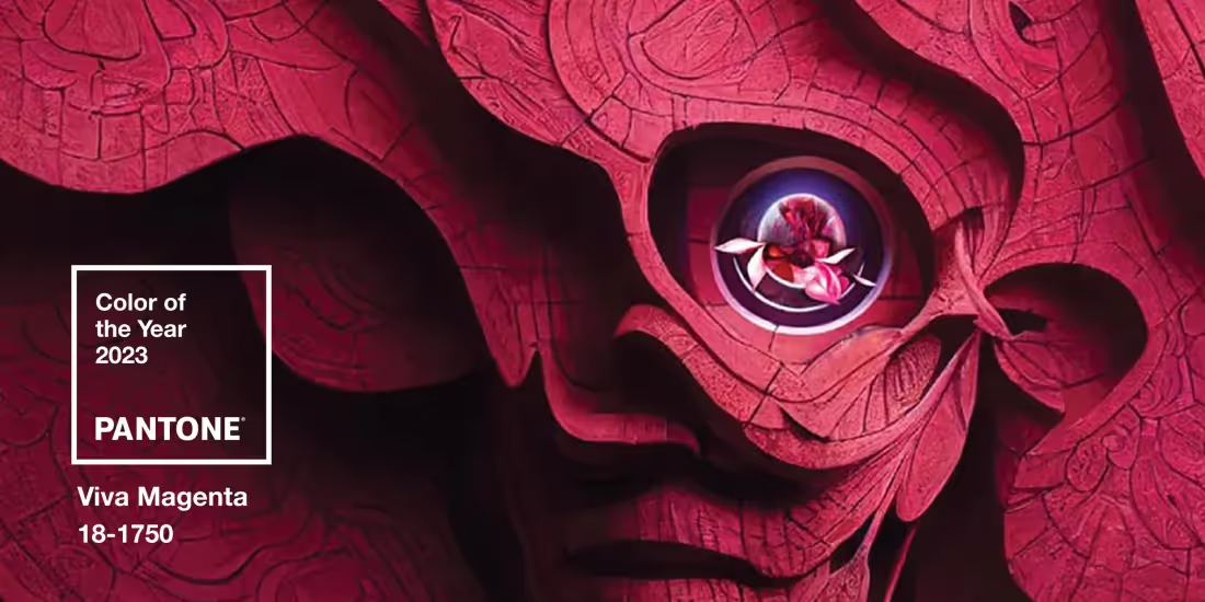
2023 Pantone Color of the Year: Viva Magenta
This year’s color is the vibrant and bold Viva Magenta. Pantone explained that their color choice was “an unconventional shade for an unconventional time.” Being a relative of the primary color red, Viva Magenta is powerful and empowering while representing strength and self-expression. Pantone shared that Viva Magenta is, “audacious, full of wit and inclusive of all, a hybrid red hue that comfortably straddles the physical and virtual in our multi-dimensional world, PANTONE 18-1750 Viva Magenta welcomes anyone and everyone with the same verve for life and rebellious spirit making it an ideal shade for a wide array of graphic applications, packaging, and multimedia design."
Including the Pantone Color of the Year in your presentation design
So how can you incorporate the year’s hottest hue into your own business designs? Here are four easy ways to add your own spin on 2023’s Pantone Color of the Year.
Use Viva Magenta as an accent color
Since Viva Magenta is adjacent to red, it’s a great color to use as an accent to call out important data or metrics. You can add the hex code to your custom theme and use it to add an annotation to graphs or charts, or to highlight important numbers or dates. Because it’s a bold color, Viva Magenta can help direct your audience to the key points on the slide helping them digest the information faster. Viva Magenta looks great as an accent color with natural, earthy tones.
Choose images with warmer colors
While your images should always (and we mean always) align with your brand, there’s room to test design trends in a risk-free way. If you want to incorporate the powerful Pantone color without losing your own brand integrity, try choosing images with warmer hues in the same family as Viva Magenta. Beautiful.ai offers a robust library of hundreds of thousands of free images and icons right within the product. Next time you’re searching for an image, use the keyword “magenta” and see what photos come up that fit with your story. It could be a textured, dimensional background, or a moody landscape with pops of (Viva) Magenta flowers.
Try a more muted tone
Viva Magenta is loud— it would probably be too aggressive and jarring as a background, and too busy as a font choice. You don’t want it to distract from your overall deck design and message. However, there are ways to be thoughtful about including it in your design without causing a jump scare. For example a more muted shade of magenta could work as a slide’s background color. Similarly, a muted tone could be used as a contrasting font on a title slide or in a heading.
Go monochromatic
If you have total design freedom— and no corporate branding to maintain— it would be fun to play around with a monochromatic look. With Viva Magenta as the primary color, you can use hues slightly darker and lighter from the same color palette family to create a trendy contrast. Ranging from light pink to deep magenta, you’ll have enough variation across each slide to use as background colors, body text, and headlines.


.avif)
.gif)

.gif)