Adding data to your presentation is a powerful way to share information. Why? Numbers say what words can’t, because they don’t lie. Using meaningful metrics and statistics throughout your presentation reveals important patterns or trends in your business, and may help push decision-makers over the line. But data can be complex, and isn’t always easy to understand, which can overwhelm an audience if it’s not presented properly. That’s why data visualization is so important.
The benefits of data visualization
Data visualization breaks down complex data and extracts meaningful insights in a more digestible way through charts, graphs, or infographics. Displaying the data in a more engaging way helps audiences make sense of the information with a higher chance of retention.
Enhances understanding
Visualizing data helps individuals comprehend complex information more easily than raw numbers or text alone. By representing data visually, patterns, trends, and relationships become more apparent.
Facilitates decision-making
Data visualization enables decision-makers to quickly grasp insights and trends from large datasets, helping them make more informed decisions. It allows for better identification of opportunities, risks, and areas for improvement.
Simplifies communication
Using infographics or charts help simplify the communication of complex ideas and findings. They provide a common language for sharing information, making it easier for different stakeholders to interpret and discuss the key takeaways.
Reveals patterns and outliers
Data visualization makes it easier to identify patterns, trends, and outliers that might be difficult to recognize when presented in a wall of text. Showcasing the metrics in visual, bite-size chunks allows audiences to get to the main point, faster.
Increases engagement
The majority of people are visual learners, and data visualization is more likely to grab the attention and engage viewers than text-based slides. Well-designed charts and graphs can evoke emotions, spark curiosity, and encourage further exploration.
Enables data exploration
Interactive data visualizations— like animated charts or graphs— helps audiences to interact with the data, drill down into details, and explore different perspectives. This empowers users to uncover new insights and ask more meaningful questions.
Supports data-driven storytelling
Data visualizations can serve as a powerful tool for influencing and persuading decision-makers. By presenting data in a compelling way, you’re supporting your overarching story, and encouraging your audience to take action.
Implementing data visualization in your presentation
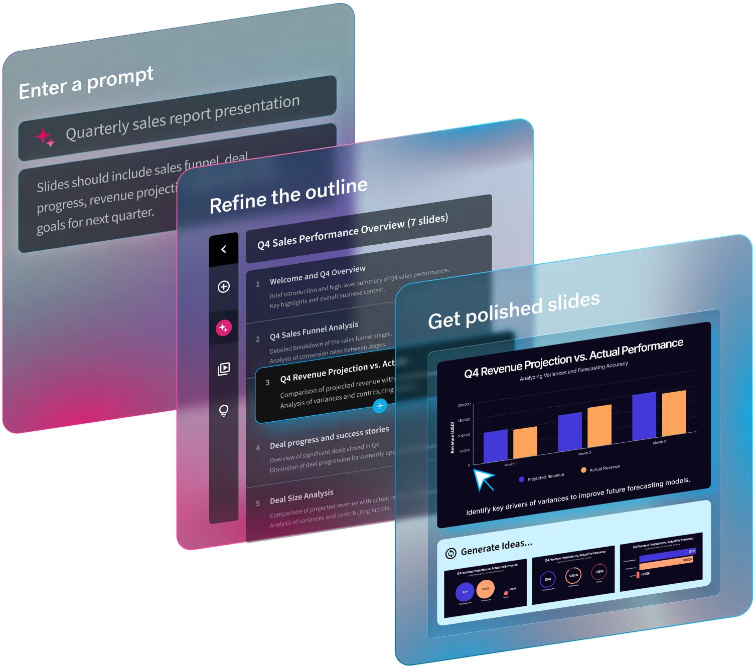
Implementing data visualization in your presentation is easier than you may think. Presentation softwares— like Beautiful.ai— offer pre-built presentation templates that allow you to plug and play with your own content. These charts and graphs are fully customizable so you can bring your data to life in just a few clicks. From bar charts and line charts to data comparison slides, there’s something for every story.
Once you choose your chart and add your content, Beautiful.ai’s Smart Slides handle the rest with design best practices in mind. You can easily change the layout, or toggle between different templates, to see what best fits your needs.
New! Data import and linking in Beautiful.ai
Even if you start with a slide template, data can be tedious, and inputting metrics into a chart or graph can take time. Now in Beautiful.ai you can import or link to preexisting data for more accurate charts, faster. Keep your data fresh and up-to-date with data linking, or import data to your chart or table directly from your preferred app and choose to link the slide to the data source. When your source file is updated those changes will automatically be reflected on your linked slide. You can import from—or link to—Google Sheets, Dropbox or Box all right from within your presentation.
The ability to import and link data gives you back the time it would take to add metrics manually to each chart or graph in your deck, so you can focus on other projects. With this new feature, Beautiful.ai makes data visualization more seamless and efficient.


.gif)


.gif)