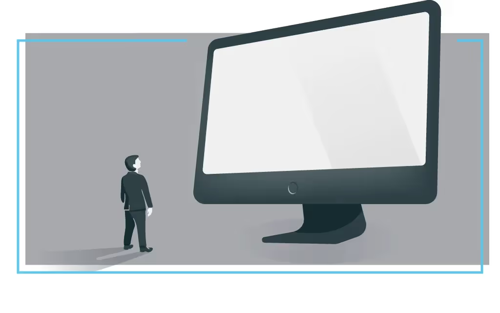
You may not be Steve Jobs, but that doesn’t mean your presentations don’t matter. It just means that you may not need the same software.
The typical keynote presentation—the one on the big stage with the big screen—takes weeks (if not months) to conceive, plan, research, write, design, rehearse, refine, and rehearse again. It usually introduces brand new ideas, communicated in new ways, to a new audience. And, more often than not, it’s the most important presentation that the presenter will deliver that year.
For these kinds of presentations, traditional software like PowerPoint and Keynote can be a worthy investment of your time, effort, and money—especially in the hands of a professional designer. With a blank slate, you’re free to communicate whatever you want, however you want. And with time on your side, you can work hand-in-hand with your professional presentation designer to build custom graphics and animations that help you tell your story; you can scrap them when they don’t work; and you can start over and build new ones. You can brainstorm, iterate, and tinker to your heart’s delight.
But what about the other 99.99% of presentations? Like the ones you make?

We’re talking here about the the report to your boss, your team's status update, your 2018 marketing plan, your agency's portfolio presentation, and the millions of other presentations that are built every day around the world. These are the decks that we barely have time to make, let alone rehearse and refine. They’re the ones that we design by ourselves, often after work hours, when we should be doing something else.
These presentations may not make us famous, but they can make our break our day, our quarter, or our year. Even if they’re presented in a conference room or over the phone, we still want them to be clear, persuasive, and, if possible, beautiful. We want to them to communicate our ideas visually so that our audience absorbs our message, stays engaged, and takes action. We just don’t have the time or resources to get this done on our own.
Until now, there hasn’t been software purpose-built for these kinds of presentations. Instead, we’ve been stuck with the traditional tools, staring blankly at a blank canvas as we try to figure out not just what to say, but also how it looks. So we hunt around the internet for templates, spend hours drawing arrows and lining up shapes, or give up and make a bunch of bullet slides.

In these situations, you’re probably not looking for freedom. You’re looking for help. Specifically, the kind of help that a designer would be able to give you, if you were lucky enough to work with one. You want somebody by your side to help you translate your ideas into visuals, adapt your design to your content (vs. other way around), and make sure that your presentation always looks modern and professional.
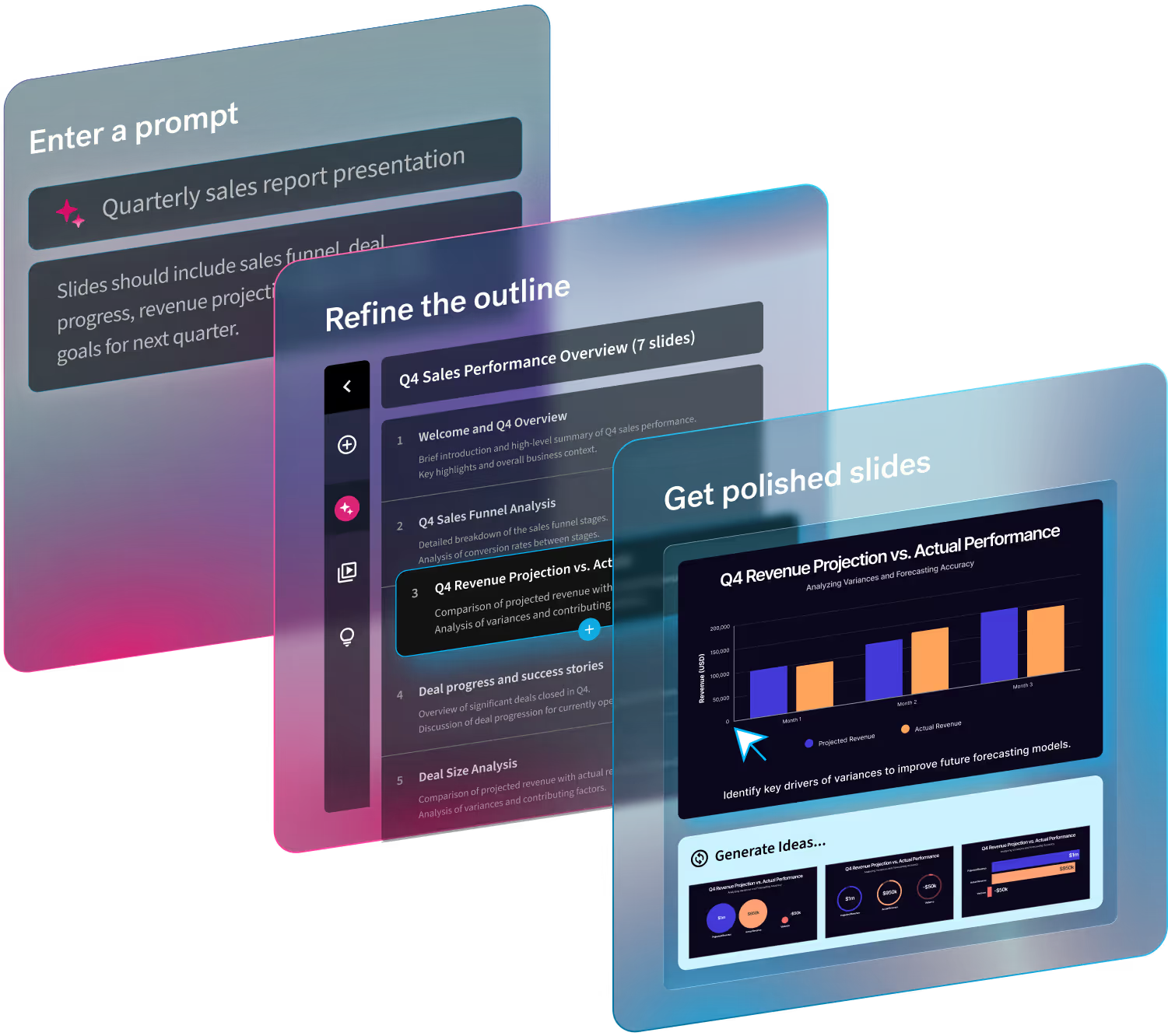
With Beautiful.AI, our goal is to give the “forgotten presenter” access to the same experience as their CEOs. By helping you to discover the best way to visualize your ideas—and then designing your slides for you—we’re hopefully doing two important things. First, we’re giving you more time to focus on the story you’re telling. And, just as importantly, we’re making that story more engaging, more persuasive, and more beautiful—no matter the stakes.
Good design is a gift, but we think it should be a given.
Beautiful.AI might work perfectly well for your next TED Talk, but that’s not why we built this tool. We built it for presentations like yours, the ones that are due to tomorrow and stressing you out tonight. We hope you'll give it a try.
Want to learn more about our first product Beautiful.AI? Check out the presentation below or sign up for your account today.

