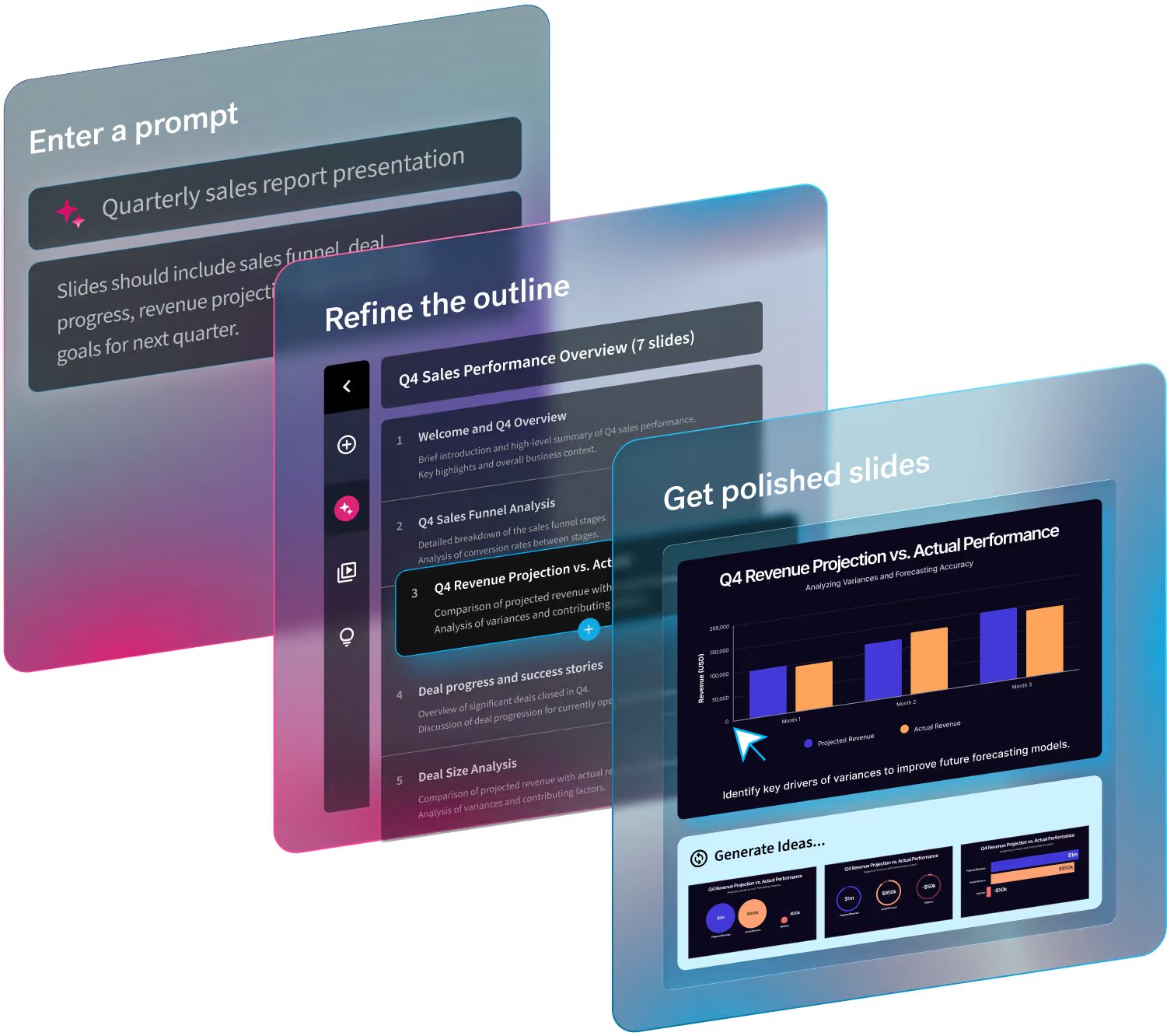
As a presentation tool made by designers but geared towards everyone, Beautiful.ai comes fully loaded with dozens of essential presentation creation features. However, if we had to pick one thing that sets us apart from the competition it would be our Smart Slide templates. Each template is carefully curated, and totally customizable, to help users craft professional slides regardless of their design skills.
With over 60 Smart Slide templates to choose from, there’s truly something for everyone. We don’t like playing favorites, so we asked you which Smart Slides you use the most. The answer? (Drumroll…). Our top three slide templates voted by our customers are 1) Photo Grid, 2) Timeline and Journey, and 3) Teams.
In this blog, we’re diving into each of the top three Smart Slides to share what they are and how you can use them in your next presentation.
Photo grid
Text alone isn’t enough to keep your audience’s attention and get your points across. You need a carefully chosen mix of graphics that will make an impact on your viewers.
A photo grid template can help your presentation tell a story visually without having to rely solely on text. Our photo grid template is one of the most versatile templates in the bunch, so it’s no wonder it’s a crowd favorite. You might use this template to show the faces behind a team of employees, share progress on a design or project, or cover important information with a mix of bold text and engaging visuals.
Use cases
The photo grid template has countless use cases. Some unique ways you can use photo grid include:
- Introduce a team, campaign, or new product or feature
- Tell your story through photos and videos
- Showcase big ideas and data
- Make lists more visually appealing
- Recap an event
- In lieu of a text slide to share information or a quote
Design tips
1. Choose photos that mean something.
Choose real photos that make sense for your presentation. For example, photos of an unfinished project to show how it’s progressing.
2. Mix & match various media.
The beauty of this Smart Slide is how versatile it is. Don’t be afraid to mix text, data, photos, and videos on one slide.
3. Take advantage of our free asset library
All of the assets in your photo grid should share a similar style. Take advantage of our free asset library to source stock images, videos, icons and logos all from right within the product.
4. Don’t let photos overrun your presentation.
You want your presentation to look good, but remember that you’re sharing information with your audience. That’s still the most important thing.
Timeline
A timeline is a visual representation marking all major events over a period of time. Timeline slides have many versatile uses—everything from project plans, to status updates, to “next steps” can be communicated using a timeline. They are most often used for business purposes, but can also be useful for better illustrating scientific and other highly technical processes.
Use cases
More great uses for a timeline slide include:
- Keeping teams up to speed on project deadlines
- Arrange nonlinear events in chronological order
- Reflect historical data visually
- Showcase milestone goals for a business
- Staying on track with a product launch
Design tips
1. Be efficient with space.
Timeline projects often space multiple data points on a single line. This requires thought organization and perfect content placement. If thoughts overlap, your audience won’t be able to distinguish them from one another.
2. Use timeline slides for projects with a history.
Timelines are meant to depict an order of events. Projects which are brand new, or information without precedent or background, don’t yet require a timeline.
3. Explore different types of timelines.
There are multiple types of timelines, such as horizontal, vertical, interactive, and chronological. The one you choose depends on what you’re trying to express to your audience.
4. Organize your timeline with spans.
Group milestones into time periods, phases of a project or steps in a process. Spans help guide your audience through each stage of your timeline journey—beginning, middle and end.
5. Try the journey slide
Similar to the timeline is the journey slide— another crowd favorite. Toggle between both templates without losing your content to see which layout looks the best with your story.
Teams
A team slide is a visual depiction of the members of your team. It should include photos, names, job titles, and can even include information about your team’s credentials or past experience. An effective team slide makes it simple for your audience to easily connect everyone involved with their role in the project.
Our team templates provide the tools required to add each component of your team slides with ease. Whether you’re sharing your slides with investors, upper management, consumers, or peers, everyone involved will know who is who, and what you do.
Use cases
Six ways you can incorporate our teams slide in your next presentation:
- Introduce investors to your leadership team
- Onboard new employees or call-out team wins
- Showcase your team's expertise to prospects
- Assign point of contacts for certain projects or tasks
- List out business partners or third parties
- Display information— like new products or campaign details— with an image and short description
Design tips
1. Your team slide should come first in your presentation.
Many presenters include a team slide as an afterthought not realizing it’s one of the most important slides in their presentation. But not introducing yourself and your team like you would at the beginning of any relationship is a missed opportunity.
2. Design matters.
Creating an effective team slide is not as simple as it first appears. A professionally-designed team slide template from beautiful.ai allows you to display content efficiently, with proper spacing and formatting to maximize its effect.
3. Play to your strengths.
Customize colors and positioning on your team slide to showcase your team in a visually pleasing manner while accentuating the most positive and original experiences of each team member. Don’t be afraid to share about who you are and what makes you tick.


.avif)


