
The idea of figma— the cloud based design tool— was born in 2011 by co-founders Evan Wallace and Dylan Field. The duo was looking for a solution to bring creative tools for designers to a web browser for accessibility. Just four years later in 2015, the software that claims to be “the first design tool that combined the accessibility of the web with the functionality of a native app” was founded.
There’s no doubt that designers see the benefit in Figma as the company has seen great success since their launch in 2015. In fact, the company was acquired by Adobe in fall 2022 in a $20B deal— Adobe’s biggest acquisition deal to date. But a lot has happened between 2015 and now, including a major rebrand.
Figma’s rebrand was just as it was intended to be— design forward. So much so that their rebrand journey influenced our own rebrand presentation template for other businesses to use.
The Figma Rebrand Presentation Template
Figma understands the importance of branding. As a company rooted in design, a brand overhaul is no small feat and comes with a lot of pressure. Figma’s rebrand was built on the idea of collaboration— much like their app— with bold colors, fun shapes, and quirky typography.
This presentation is using Figma's 2019 rebrand as inspiration to showcase the type of slides that can help marketers present the new face of their brand to employees, partners, and investors in a more impactful way. You can see more details of their rebrand here.
Title
Like any title slide, the title of your rebranding deck should be eye-catching and bold. A Title slide can either make or break your presentation by hooking the audience early on or losing them to boredom. Because this is a rebrand presentation, your title slide is the first introduction to what the new company identity will look like. It should include an on-brand background image, your new logo, and incorporate pops of your new brand colors— and in Figma’s case, shapes.
The Pitch
Including a pitch slide is sharing your “why” for the project. When presenting your rebranding to key stakeholders— like investors or partners— the pitch should outline why your team chose to do a rebrand and what you intend for it to do for the business. Use a bullet point slide early on in the presentation so your audience understands how you landed on certain design choices.

A Quote
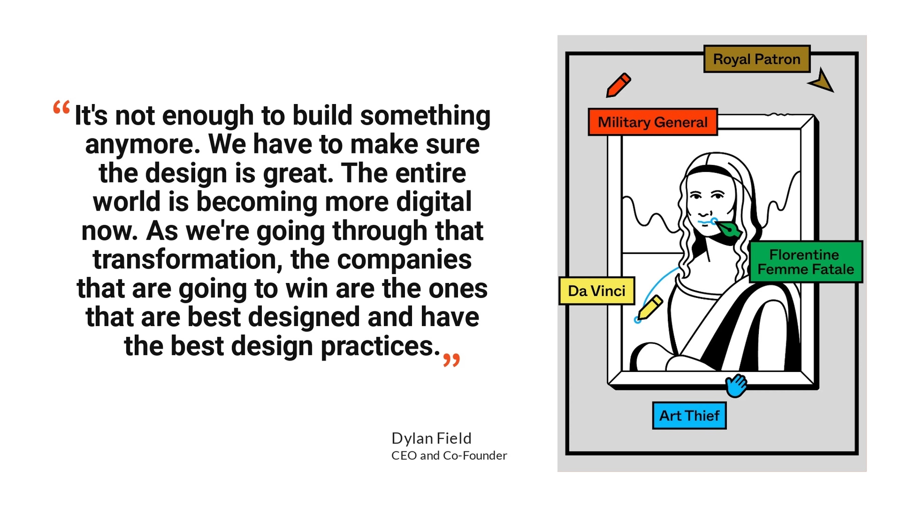
To provide more context, you might include a quote in your rebrand presentation. This could look something like your company’s mission statement, a quote from the creative director spearheading the project, or a combination of both. Whatever quote you decide to run with, we recommend using our Headline or Quote slide with contrasting colors so the text pops.

Design Team
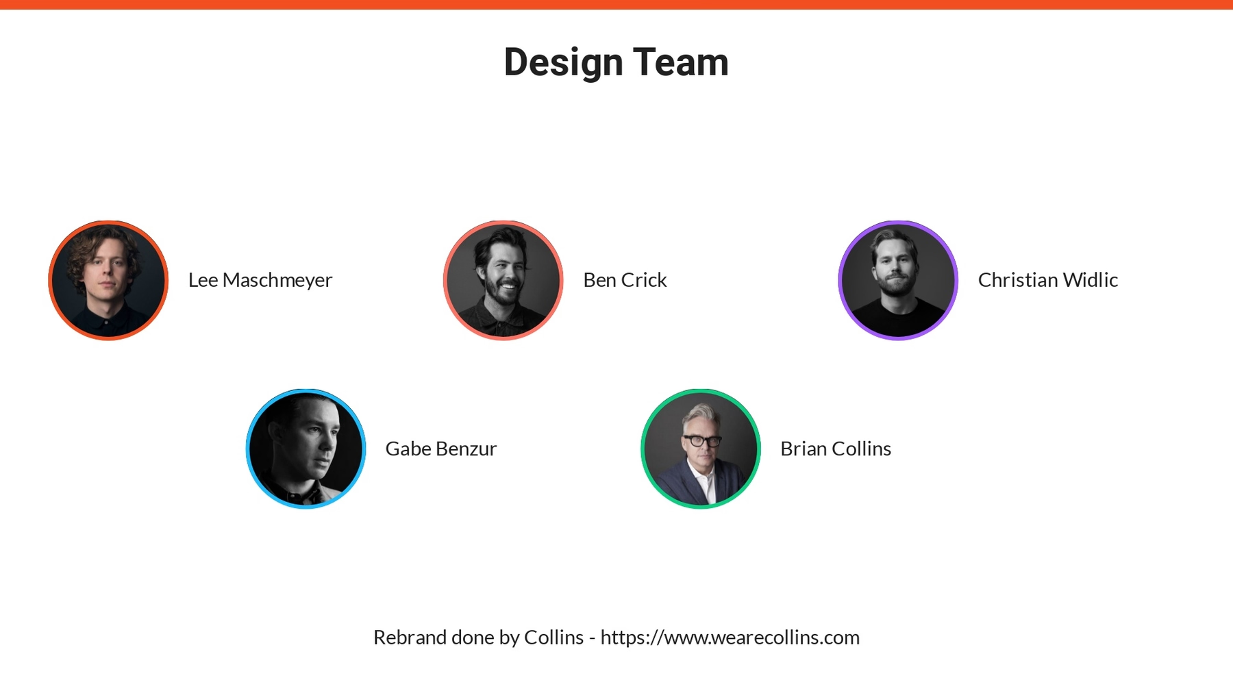
Who led the rebrand? Most rebrand presentations will include a slide of the design team who owned the project. Considering they spent a lengthy amount of time bringing their vision to life, it’s nice to give credit where credit is due. Our Team Members slide is great for introducing the design team and how they each contributed to the new brand identity.
Brand Attributes
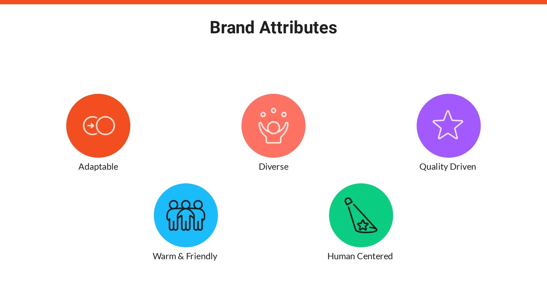
What are the key attributes of your brand? These are the characteristics and core values that make up your brand as a whole. In Figma’s case they included things like adaptable, diverse, quality driven, human centered, and warm and friendly. Use our Icons with Text slide to list out your brand attributes so that your team can understand how you landed on certain branding decisions.
Logo Evolution
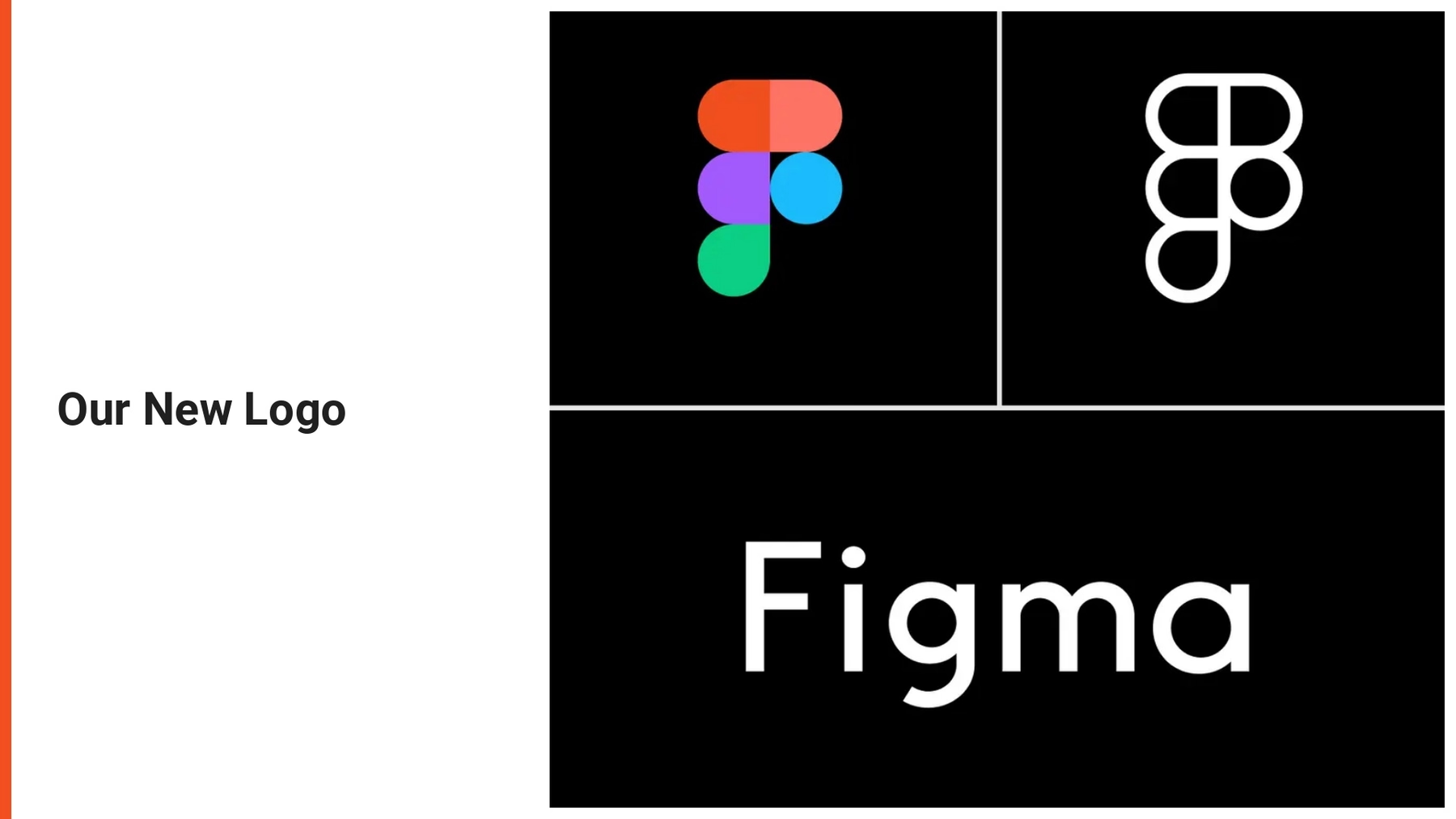
It’s extremely common for brands to revamp their logos during a rebranding process. In a rebrand presentation you can include a Photo Grid slide to showcase the evolution of the logo with different image cells. This helps stakeholders understand key differences between the old and new logos, and the rationale behind the changes.
New Colors
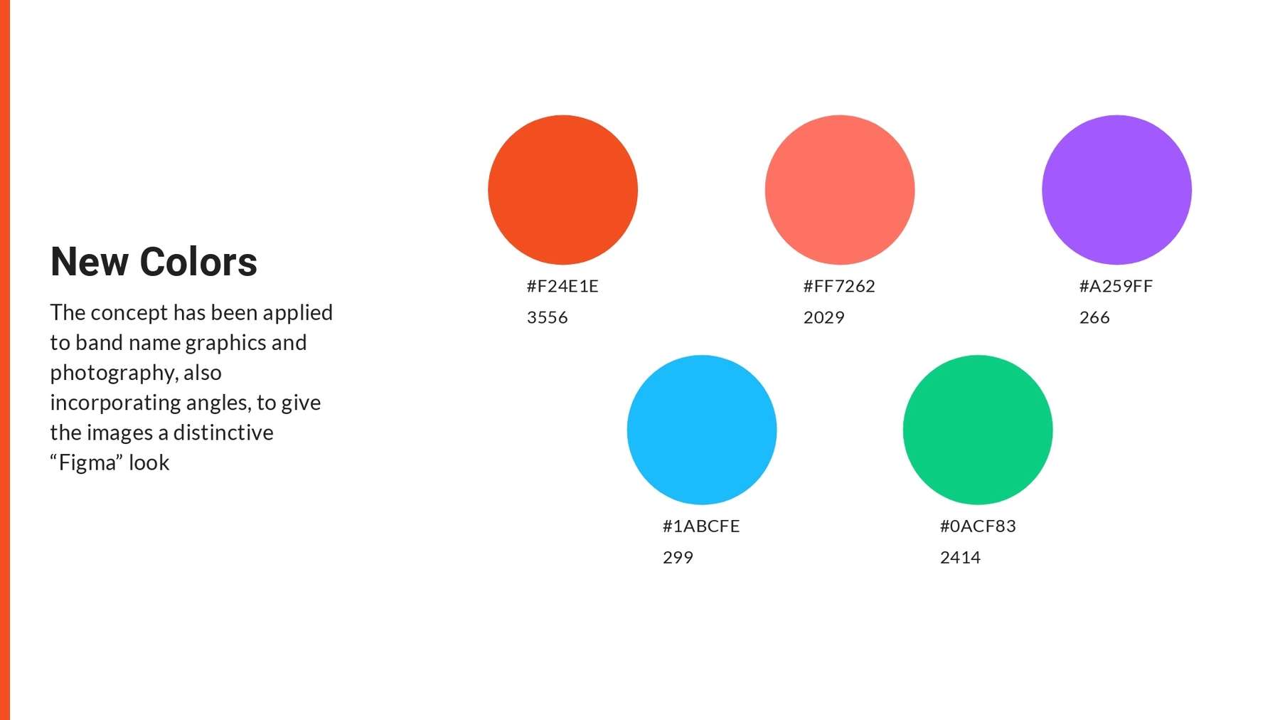
Including a colors slide ensures that the team is aligned on brand-approved colors moving forward to use in sales collateral, marketing materials, and designs. We used an Icons with Text slide to include a display of Figma’s new colors in each icon bubble. Your team can use this slide as a resource to find color HEX codes down the line.
Typography
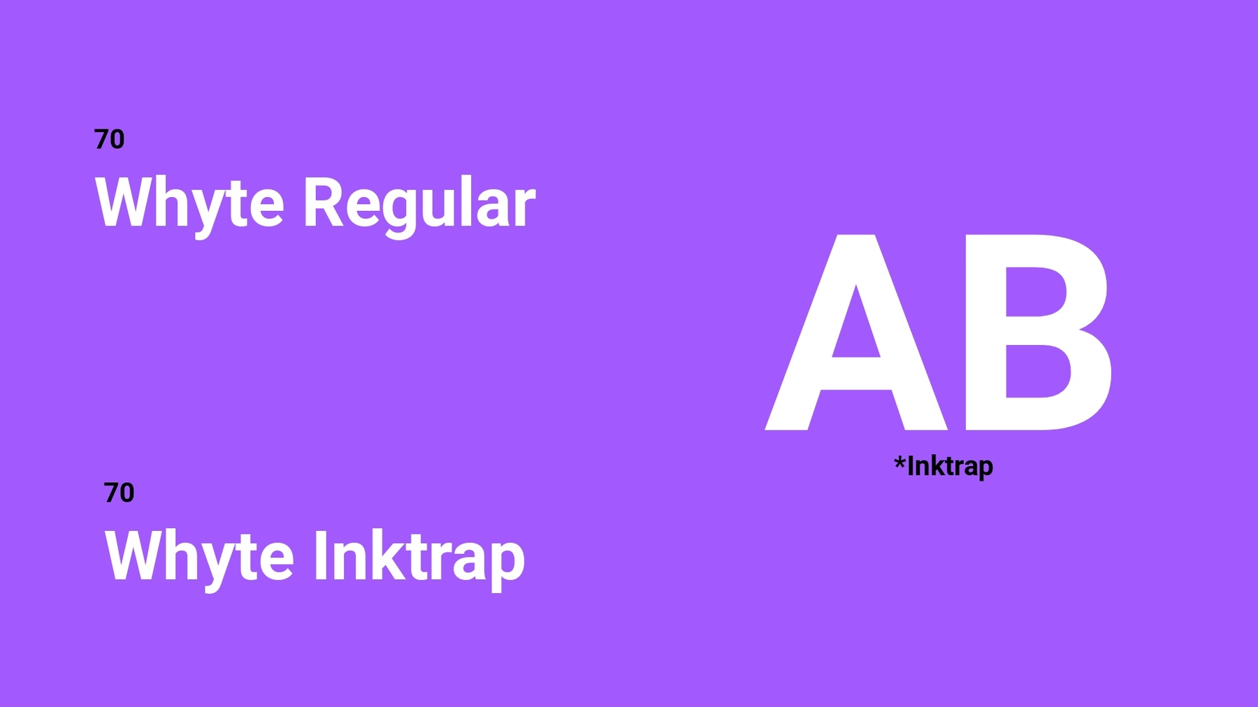
This slide acts as a good reference point for the team members who need to be reminded which typography that they can use in any branded assets. It should include an example of the text, the name of the text, and different variations of the text (i.e. header and body copy). Figma’s rebrand shared examples of their new branded font: Whyte Regular and Whyte Inktrap. With a Text slide you can also include a brief description of the font and why you chose it.
Branded Material
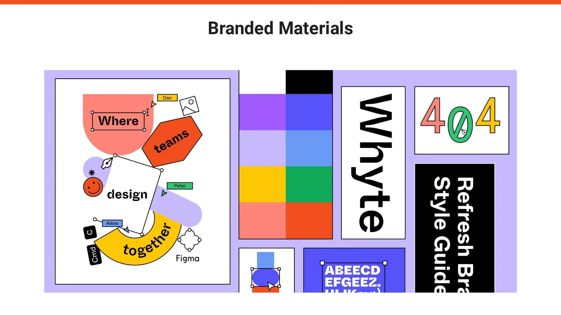
Including examples of branded material with the new aesthetic can help stakeholders and team members really understand the new look. We used a Photo Grid slide to showcase a collection of branded material. This can be new graphics, custom imagery, or sales materials that reflect the new company branding.
Website Example
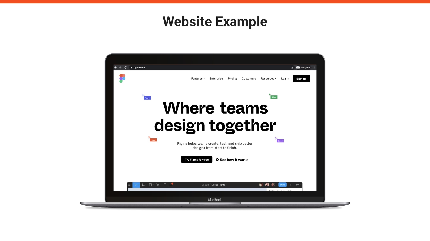
How did the rebrand come to life? Here you can use the Product Screenshot slide, or the Webview slide, to showcase the new and improved website which reflects the branding refresh. This can be simple screen grabs, or an interactive view, to give your team a chance to see the new site design before it goes live.
Public Campaigns
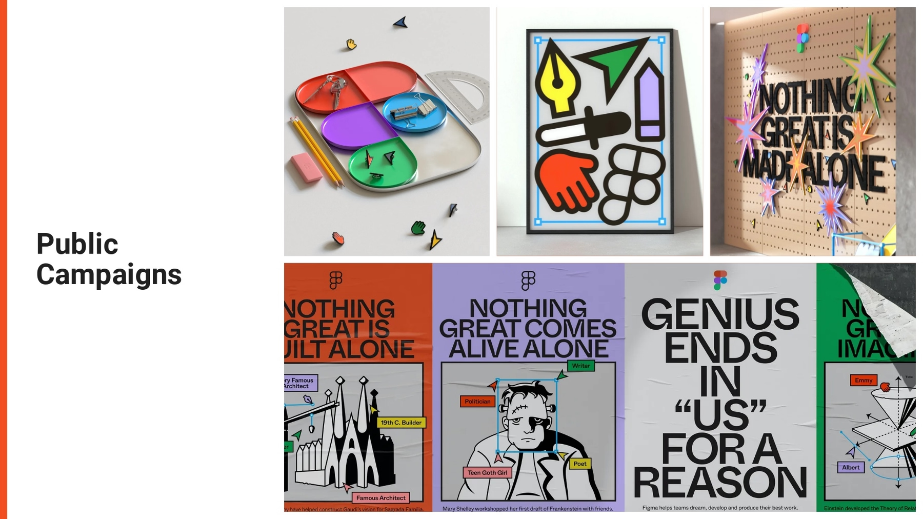
To really bring the rebrand home, share out some of the public-facing campaigns that will go out on the day of the launch. We used the Photo Grid slide template to be able to include a variety of assets on one slide. This helps those who weren’t involved in the rebranding process envision how it will look in the wild.
Closing
How do you want to close your presentation to really make a big impact? We chose to end the Figma rebrand with an animation of the new logo coming to life on an Image slide. It brings the entire rebrand full-circle, while ending on a powerful note.




.avif)
.gif)

