
Unless you’ve been living under a rock, you’ve seen the Spotify Wrapped circulating on social media the past couple of weeks. Spotify Wrapped is essentially a round up of the listeners’ most played songs and artists over the course of the year. Starting in early December, Spotify users start to share their “Wrapped” list with friends and followers on social media platforms. The social media movement— coined by #spotifywrapped— has undoubtedly become a part of Spotify’s brand and was intentionally launched alongside their 2016 rebrand.
Spotify is the world’s leading audio streaming service with over 80 million songs and 4 million podcasts available to subscribers. Founded in 2006, the software has grown to nearly 500 million users worldwide in 2022. In 2016, the team at Spotify recognized the need for a rebrand in order to appeal to their core audience of millennials. Their brand prior to 2016 looked like your typical tech company with generic fonts, mild colors, and a logo meant to represent a sound wave. In an effort to freshen up their brand identity, the Collins team revamped the iconic Spotify green with a more modern hue, updated their logo, chose a new style of imagery, and retired their overall bland color palette.
Spotify’s rebrand was just as it was intended to be— inspiring. So much so that their rebrand journey influenced our own rebrand presentation template for other businesses to use.
The Spotify Rebrand Presentation Template
In any industry, a rebrand has many moving parts. At the surface level you’re doing a total overhaul of an existing brand to change its corporate identity. But behind the scenes there’s an entire creative process that includes the evolution of the brand, pitching new ideas, design exploration, and bringing the new brand to life. A rebrand presentation can help keep creative teams organized from beginning to end during the rebrand journey. It can also act as a platform for them to introduce the new brand to key stakeholders and audiences.
We created a fully customizable rebrand presentation template using Spotify's 2016 rebrand as inspiration to showcase the type of slides that can help marketers present the new face of their brand to employees, partners, and investors. You can find more details of their rebrand here.
Title
Like any title slide, the title of your rebranding deck should be eye-catching and bold. A Title slide can either make or break your presentation by hooking the audience early on or losing them to boredom. Because this is a rebrand presentation, your title slide is the first introduction to what the new company identity will look like. It should include an on-brand image, your new logo, and incorporate pops of your new brand colors.

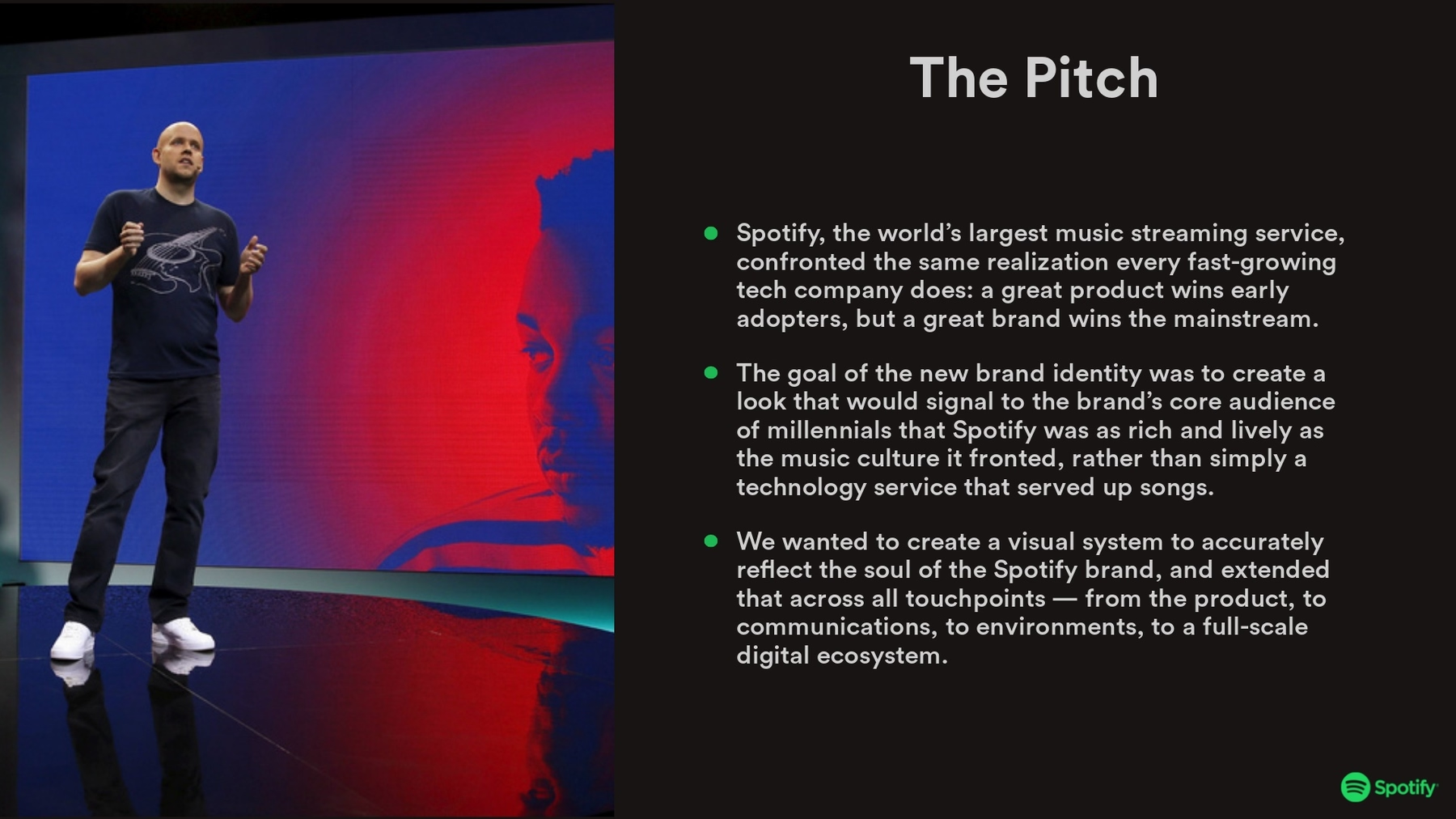
The Pitch
Including a pitch slide is sharing your “why” for the project. When presenting your rebranding to key stakeholders— like investors or partners— the pitch should outline why your team chose to do a rebrand and what you intend for it to do for the business. Use a Text slide early on in the presentation so your audience understands how you landed on certain design choices.
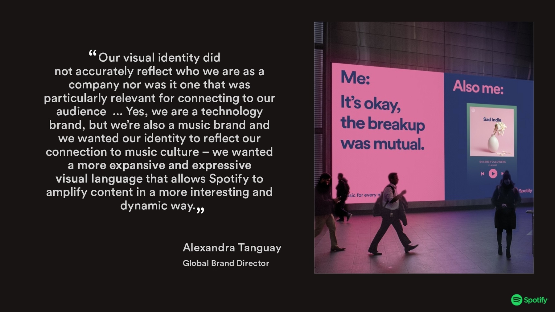
A Quote
To provide more context, you might include a quote in your rebrand presentation. This could look something like your company’s mission statement, a quote from the creative director spearheading the project, or a combination of both. Whatever quote you decide to run with, we recommend using our Headline or Quote slide with contrasting colors so the text pops.

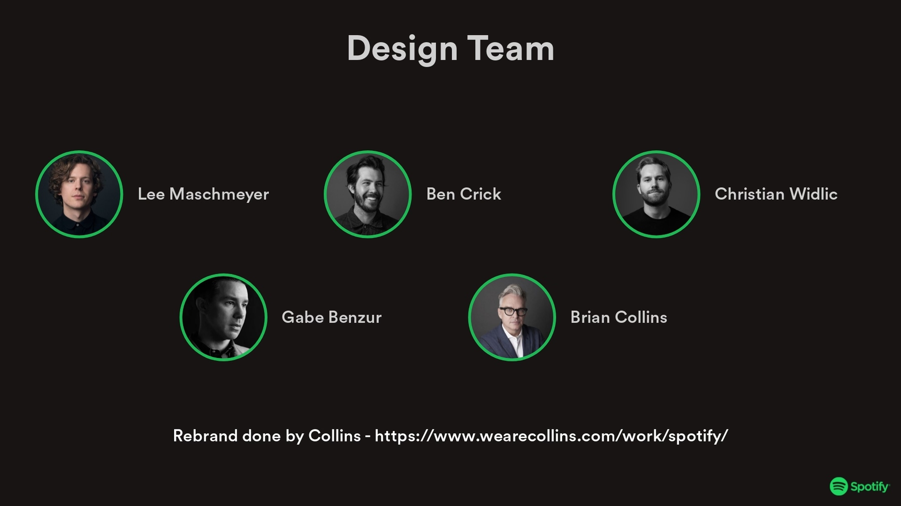
Design Team
The design team behind the rebranding project likely spent a considerable amount of time bringing their vision to life. Give credit where credit is due. Our Team Members slide is great for introducing the design team and how they each contributed to the new brand identity.
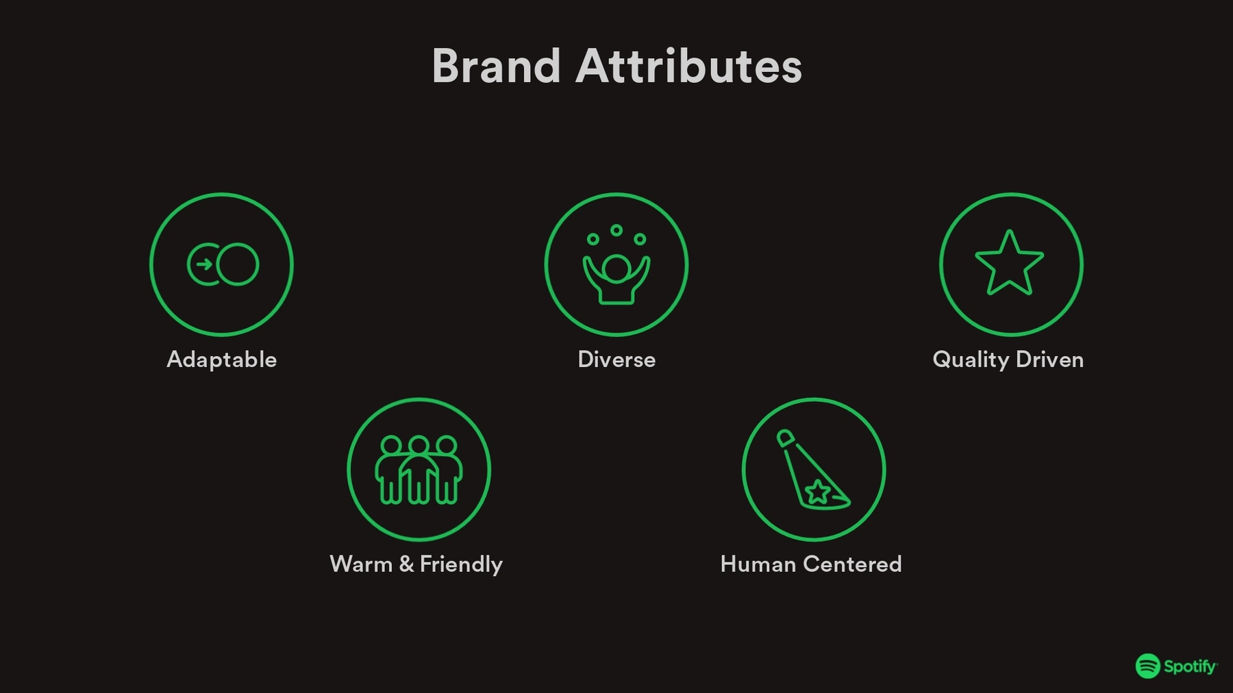
Brand Attributes
What are the key attributes of your brand? These are the characteristics and core values that make up your brand as a whole. In simpler terms, it’s your brand’s personality— which has a direct impact on what your brand identity should look like. Use our Icons with Text slide to list out your brand attributes so that your team can understand how you landed on certain branding decisions.
Creative Exploration
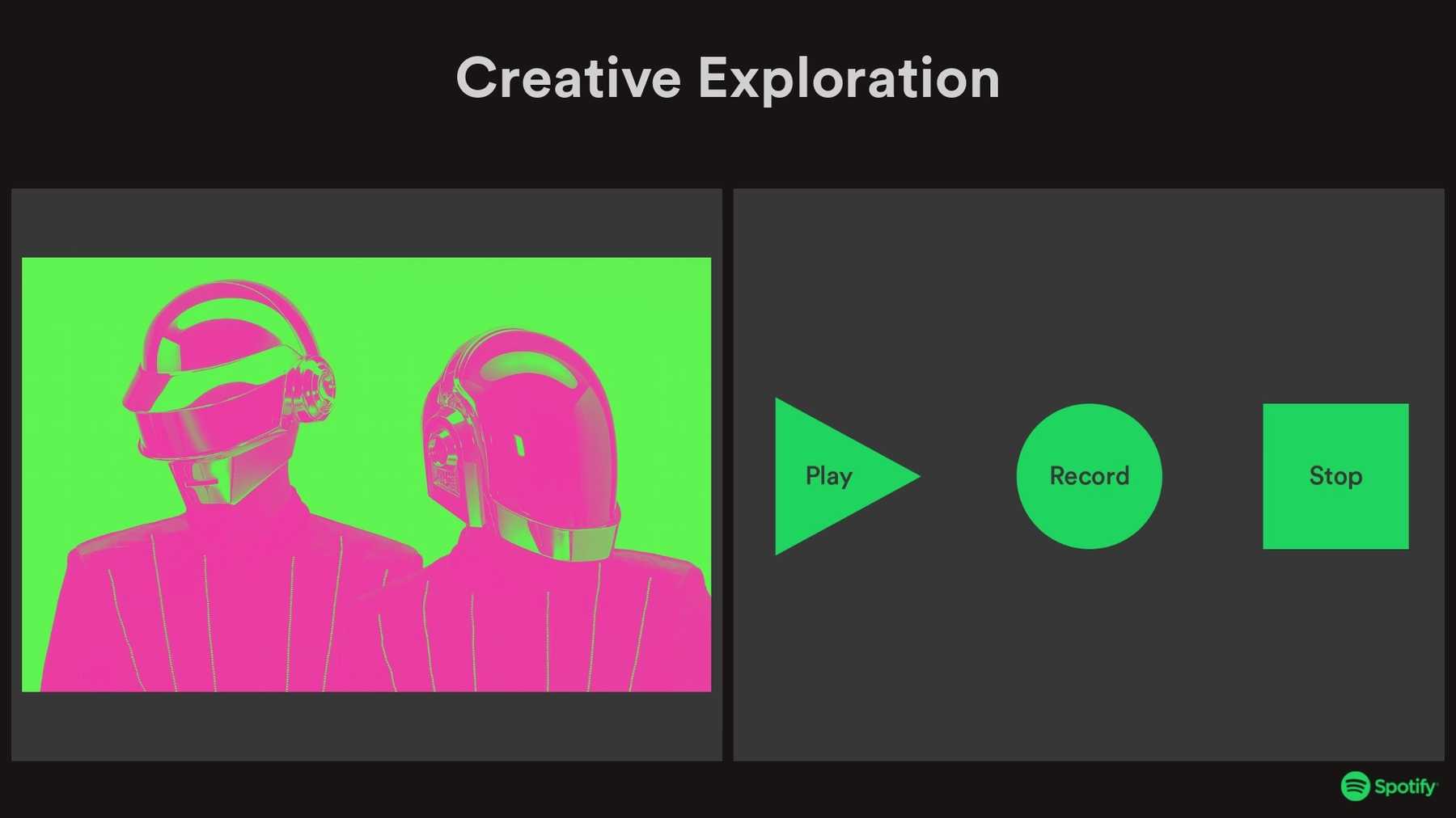
What led your team to the final branding? Here we used a Photo Grid Smart Slide template to show what the creative exploration process with different variations of imagery, graphics, typography, colors, and logos looks like.
Logo Evolution
It’s extremely common for brands to revamp their logos during a rebranding process. In a rebrand presentation you can include a Photo Grid slide to showcase the evolution of the logo with different image cells. This helps stakeholders understand key differences between the old and new logos, and the rationale behind the changes.

Brand Guidelines
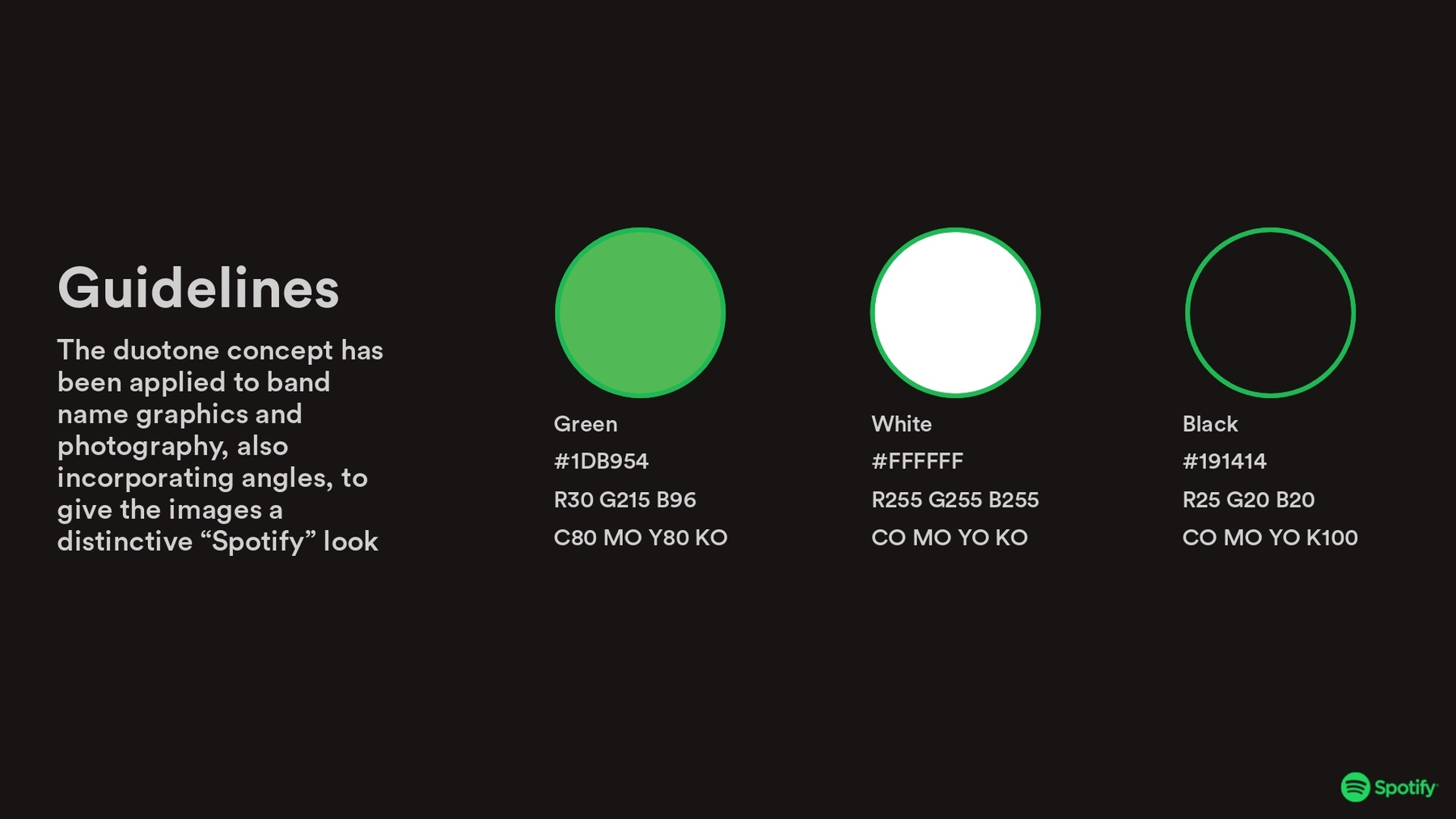
A brand guidelines slide is where you ensure the team is aligned on brand-approved materials moving forward. We used an Icons with Text slide to include a display of new icons, imagery style, and the new branded colors. Your team can use this slide as a resource to find color HEX codes down the line.
Typography
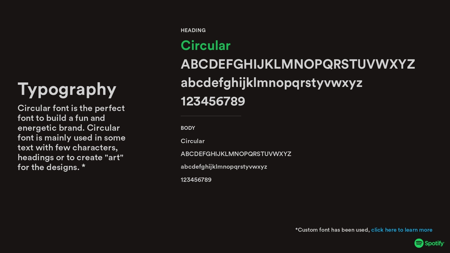
This slide acts as a good reference point for the team members who need to be reminded which typography that they can use in any branded assets. It should include an example of the text, the name of the text, and different variations of the text (i.e. header and body copy). With a Text slide you can also include a brief description of the font and why you chose it.
Branded Material
Including examples of branded material with the new aesthetic can help stakeholders and team members really understand the new look. We used a Photo Grid slide to showcase a collection of branded material. This can be new graphics, custom imagery, or sales materials that reflect the new company branding.

Website Example
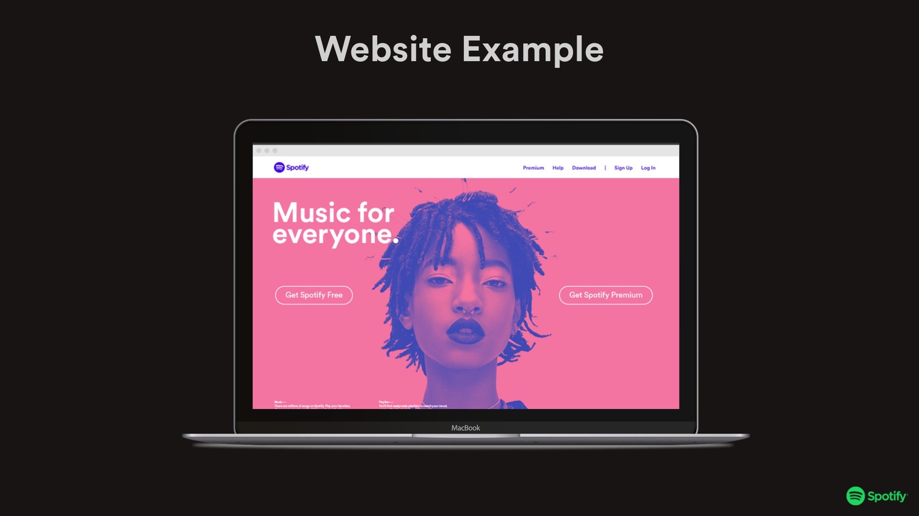
What does the new website look like with the rebranding in place? Here you can use the Product Screenshot slide, or the Webview slide, to showcase the new and improved website. This can be simple screen grabs, or an interactive view, to give your team a chance to see the new site design before it goes live.
Public Campaigns
To really bring the rebrand home, share out some of the public-facing campaigns that will go out on the day of the launch. We used the Photo Grid slide template to be able to include a variety of assets on one slide.




.png)
.gif)
