A presentation—when done properly—can persuade, inspire, and mobilize action. Your slides aren’t just a formality of going through the motions of a presentation, they’re a design experience that can either amplify or dilute your message.
When designed well, a presentation can:
- Simplify complexity – turning a wall of data into a visual story that clicks instantly.
- Guide attention – leading the audience’s eyes to the right information at the right time.
- Build credibility – polished slides convey competence and professionalism before you even speak.
But when slides are poorly designed, they work against you:
- Visual clutter overwhelms the message — too many fonts, colors, or elements create cognitive overload.
- Inconsistent design breaks trust — mismatched layouts feel sloppy and distract from the content.
- Missed opportunities to persuade — when data is hard to read, your insight is lost.
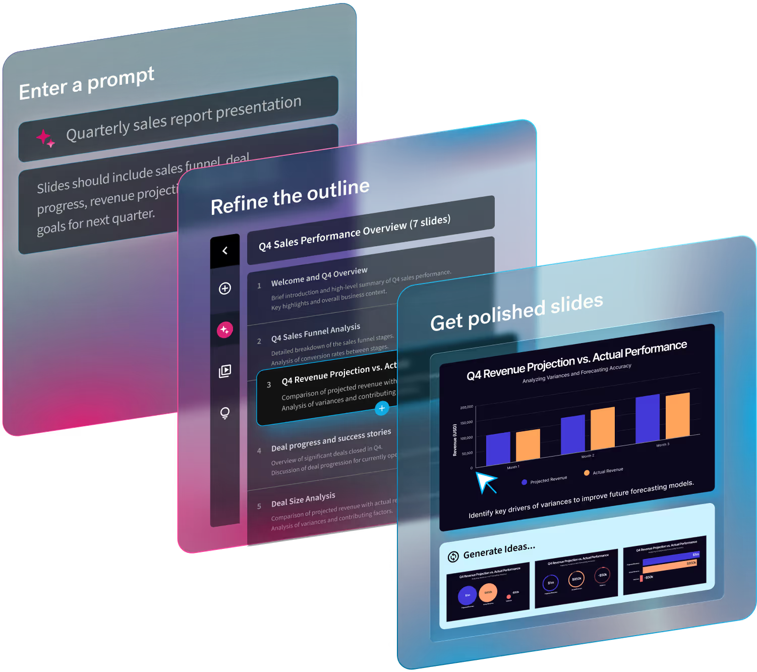
In an era of short attention spans and back-to-back Zoom calls, good design is no longer optional—it’s how you earn and hold your audience’s focus. Thankfully, tools like Beautiful.ai make this easier by automating design choices, applying consistent branding, and letting you spend more time on your story than tedious formatting decisions.
8 Key elements of a good presentation
Let’s explore the eight key elements that make a presentation stand out, with a particular focus on design choices that make them shine.
1. A clear, visual objective
Every presentation needs a North Star. What is the single takeaway you want the audience to remember? Design can reinforce this objective. Use a strong title slide, clear section headers, and visual hierarchy to keep your message front and center.
With Beautiful.ai, Smart Slide layouts are built to naturally highlight key points, so your objective doesn’t get lost in a sea of text.
2. Audience-centric messaging with intentional layout
Knowing your audience is half the battle; designing for them is the other half. If you’re presenting to executives, keep slides lean with top-level insights. For technical teams, use clean data visualizations that dig deeper.
Design tip: use progressive disclosure—reveal information step by step instead of crowding everything onto one slide. Beautiful.ai’s animations make this seamless by allowing you to choose how information builds on each slide.
3. A story arc supported by design flow
Good storytelling isn’t just about words, it’s about how slides work together visually. Think of your deck as a storyboard: consistent layout patterns, recurring colors, and visual motifs make the experience cohesive and memorable.
Beautiful.ai helps you maintain visual flow by locking in alignment, spacing, and design rules so your narrative feels intentional, not pieced together.
4. Consistent branding
Inconsistent fonts, colors, or styles can make even the best content feel amateur. Good presentation design uses a consistent type hierarchy (headline, subhead, body) and a defined color palette to guide the eye.
Beautiful.ai automatically applies your brand’s fonts and colors across the deck with a custom theme, so even non-designers can produce slides that feel like they came from your creative team.
5. Visuals that serve a purpose
Every image, icon, or chart should earn its place on a slide. The best visuals clarify, simplify, or add emotional weight. Avoid clipart or overly literal images that feel generic.
Design tip: use data visualizations with clear labels and enough white space to breathe. Beautiful.ai’s dynamic chart layouts adjust as you edit, keeping your visuals balanced and legible.
6. White space as a design tool
One of the most overlooked elements of good presentation design is white space—the empty area around content that gives it room to stand out. Cramming every inch of a slide with text or images makes it harder for the audience to know what to focus on.
Beautiful.ai’s smart layouts automatically balance content, so your slides feel clean and sophisticated without requiring manual alignment.
7. Brevity through design constraints
Good design imposes limits that lead to clarity. When you’re forced to fit an idea into a single, well-structured slide, you naturally distill your thinking.
Beautiful.ai’s templates are intentionally designed to discourage text overload, nudging you toward clarity by making slides visually optimized for fewer, stronger points.
8. A visually impactful call to action
Your final slide is prime real estate, so don’t waste it on a generic “Thank You.” Instead, design a closing slide that visually reinforces your key message and next steps. Use bold typography, a single striking image, or a strong color block to make it memorable.
Beautiful.ai makes it easy to create a closing slide that feels like the exclamation point on your story, leaving the audience with both clarity and momentum.
Putting it all together
Good presentation design is about more than aesthetics, it’s about communication, comprehension, and credibility. By focusing on visual clarity, consistency, and storytelling, you create slides that elevate your talking points.
With Beautiful.ai, you don’t need to be a designer to create a presentation that looks intentional and professional. Smart templates, brand controls, and automated layouts mean you can spend less time tinkering with fonts and more time crafting a message that sticks.

.gif)
.gif)


