Slack Presentation
.avif)
.avif)
Overview
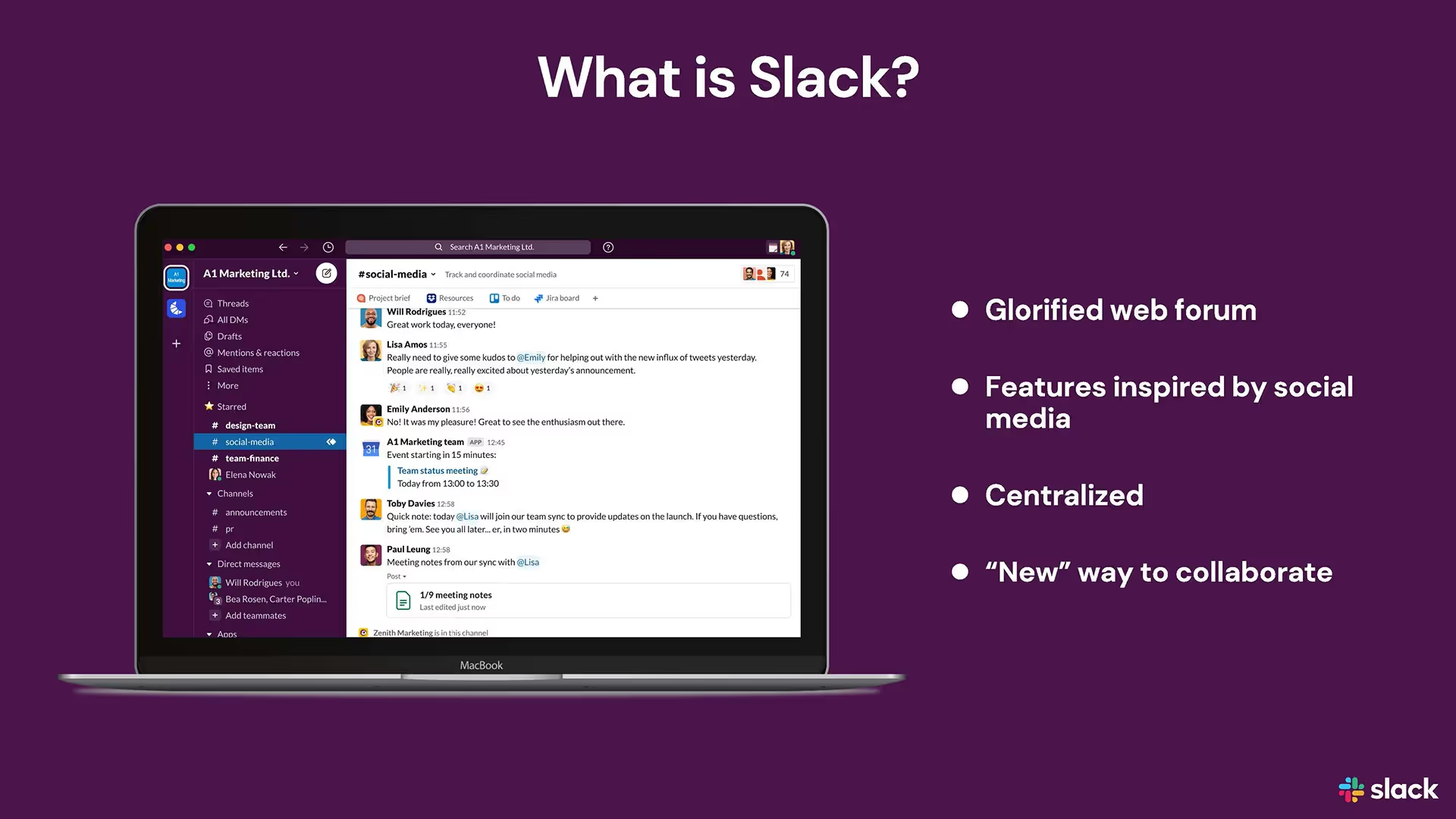
Regardless of whether you’re on a team of 3 or 300, you’re probably familiar with Slack. The app helps colleagues and stakeholders stay connected and communicate better — especially for hybrid teams embracing remote work.
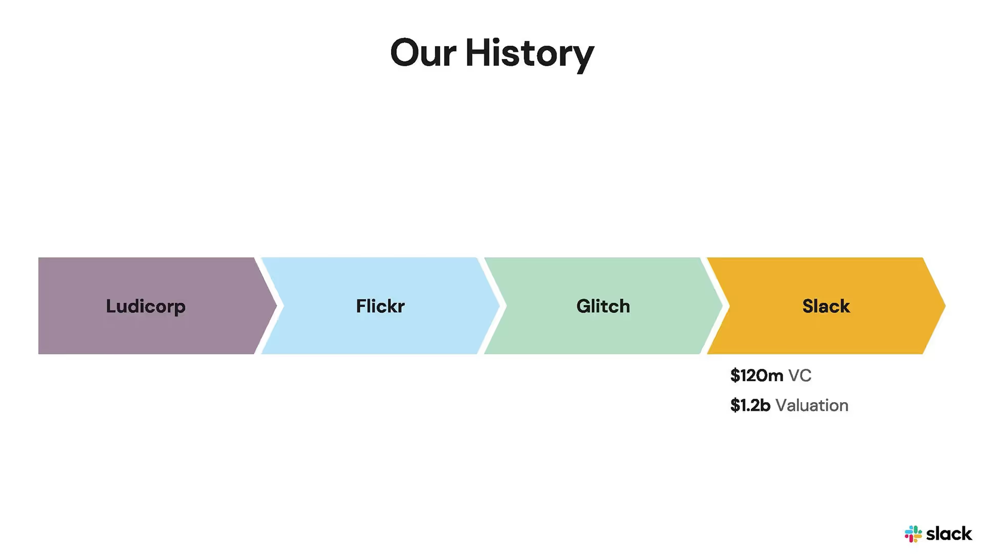
Founded in 2009 by Stewart Butterfield and Cal Henderson, Slack is a messaging app that connects the right people, information, and tools to improve workflows and collaboration. Over half of the Fortune 100 companies use Slack to connect their teams and drive their businesses forward. Slack was acquired by tech conglomerate, Salesforce, in 2021 in a $27.7 billion dollar deal that added the messaging app to its suite of enterprise software. But Slack, like all tech companies, had to start somewhere.
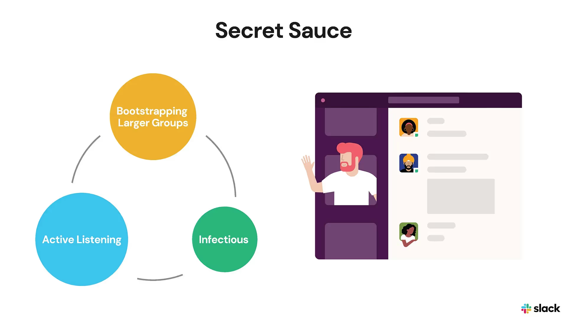
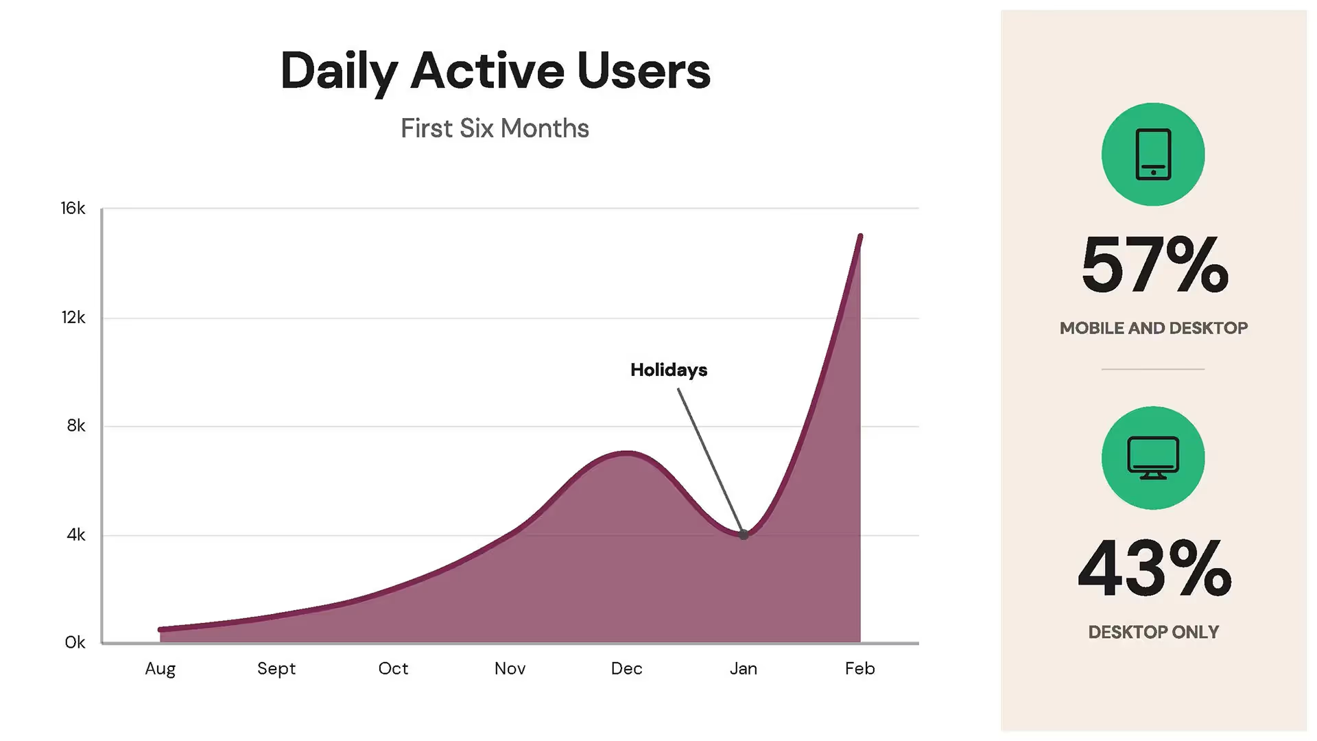
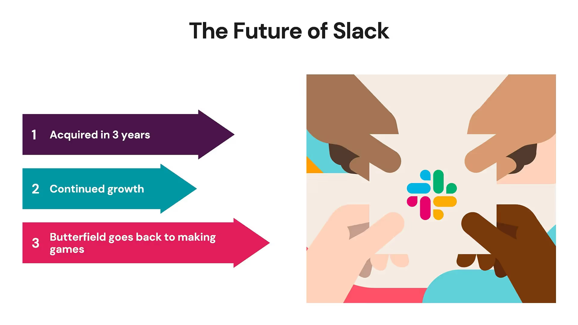
Despite their impressive acquisition, the founders of Slack had to pitch their company to investors in order to get it off of the ground. Check out the Beautiful.ai redesign of the pitch deck.
Check out the Slack Pitch Deck makeover in Beautiful.ai

.avif)

Quick tips for creating a successful pitch deck
Be brief and concise
Each slide makes an impact
Keep it simple
Use Visual Aids
Related templates

Total Addressable Market (TAM) Presentation Template

Construction Industry Business Pitch Presentation Template

Fundraising Presentation Template
The AI presentation maker for faster impact
With AI that kickstarts your deck and Smart Slides that handle the formatting, you can focus on your story, not the alignment. Go from create, edit, to present with designer-level polish and in a fraction of the time.
Features to ideate, edit, collaborate, and present.
We’re a complete presentation platform. Everything you need is in one place.
Smart Slides
Smart Slides auto-align, resize, and animate your content as you edit, so you focus on the message, not formatting.
Create with AI
Kickstart your ideas with AI. Just enter a prompt, add extra context, and get a beautiful presentation in seconds.
Themes & brand control
Define colors, fonts, logos, icons, and footers once. Save and reuse brand themes across decks and teams.
Data visualization
Instantly create animated charts and graphs. Link any spreadsheet for fast edits and live updates.
Image libraries
Get direct access to an expansive library of free, real-life stock images and videos, no need to leave your slide.
Presentation templates
Discover our gallery of professionally designed presentation templates, multi–slide decks built to give you a head start.
Presentation workflows
Shared slide libraries, real-time collaboration, user permissions, locked themes, and more.
Viewer analytics
Control access, and track engagement so you know what resonates, and when to follow up.
Animation & narration
Add embedded voice or video context to any slide - so your message lands clearly even when async.


Related blog posts
.png)
How Do I Give My Presentation a Polished Look?
.gif)
The Ultimate Guide to AI Presentation Prompts: How To Get Better Slides From an AI Presentation Maker
.gif)
Best Practices for AI Presentations in Global Teams

Try it free for 14 days
Start building Beautiful presentations.


