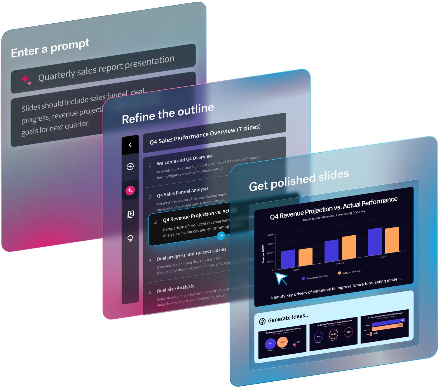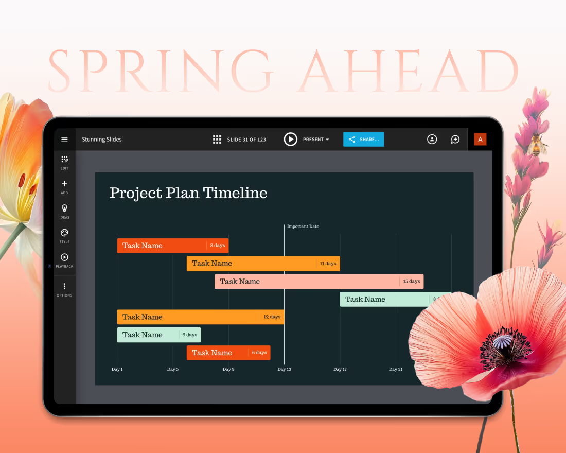
Are you getting bogged down by blank slide syndrome? There’s a Smart Slide for that.
Beautiful.ai’s Smart Slides are inspired, ready-to-use slide templates so you never have to stare at a blank slide again. With over 60 customizable templates to choose from there’s a chart, infographic, or bulleted list for everyone, and every story. Each slide template offers you the blueprint to create a professional presentation without needing professional design skills.
The magic is in the technology. With Smart Slides, you don’t have to be an experienced graphic designer to create a beautiful, engaging, and impactful presentation. Simply add your content and the slides will automatically adapt and adjust using principles of good design as the north star. As you plug in your content, the text boxes and visual elements will resize and auto-align themselves to ensure a professional design, everytime.
The goal of Smart Slides has always been to handle the design decisions for you, to make it incredibly simple and easy for you to create beautiful presentations regardless of your expertise. However, with seamless customizations, you can quickly tailor the design to match your personal style.
You’ve picked your slide templates, and added your content— now what?
A step-by-step guide to easy Smart Slide customizations
To help you get the most out of Beautiful.ai, we’re breaking down the top 6 ways you can easily customize Smart Slides to reflect your brand and make them your own.
Changing colors, backgrounds, & accent colors
Colors and backgrounds allow you to include branded elements throughout your presentation.
Background style
To access your background style, click on Edit Theme>Color>Background Style
Background styles are a great addition to any slide. There are five different types of background styles you can add to your slide.
- None: No style, just a flat color.
- Vignette: The edges of your slide are softened with an oval vignette (frame)
- Gradient: A procedurally smooth color change from light to dark in the color of your choice (theme color)
- Reverse: Reverse of Gradient (dark to light)
- Border: Each slide will have a border
Background colors
You can customize your background color at a global presentation level or slide by slide. To access your background colors, click on the Edit Theme button on the left. From the Colors tab, scroll down to the Background Colors section.
- Light: This should be set to a light color.
- Dark: This should be set to a dark color
- Default: This is the default color of your slides. You can set the default color of your slides to any of the colors in your Palette
Text colors
The tool will change your colors depending on the background color of your slide. If you have a light background color, it will use the dark color you set here for your text. If you have a dark background, it will use the light color you set here for your text.
When customizing your Text Colors, keep in mind that the color on the left should be a dark color. The color on the right should be a light color.
- Primary Text color: This controls primary text like heading text, chart text, and timeline lines
- Secondary Text Color: This controls secondary text elements like body text, chart lines, and labels.
Adding an item & dragging to reorder them
To add an item to your slide, click the icon with the plus sign that says “Add Item” underneath the slide. After you have added all of your content to the slide, you can select the box you want to move. Once highlighted, hold down the dots on the left side of the block with the mouse and drag it to swap positions with another item.
Moving the header from top to left
To customize your header style and alignment, click on Edit Theme. From the Decoration section, click Header Style or Header Alignment.
Header Style
- Plain: Displays your text without any decoration
- Underline: Adds a decorative bar under your header text, above your sub-header
- Left Bar: Adds a decorative bar on the left of your header and sub-header
- Top Bar: A bar spanning across the entire length of the top of your slide
- Block: Will add a solid
Adjusting text
When you’ve entered your text on the slide, you can make edits so that certain words or sentences pop. Click on the text block and you’ll see options to edit the font weight, size, and positioning.
Adding a tray
An easy way to add personal style to your slide is to add a tray. Click the “Layout” button on the left side panel and select a “Tray” option at the bottom. You can use your tray for additional text, to add an image, or both.
Adding image to tray + adding text overlay
To add an image to a tray, click the camera icon within the tray to access our free image library. Then, click on the image in the tray and select the “Settings” wheel. In the settings, you can toggle the “Show Text” feature on to layer text over your image.

.gif)


