Desktop
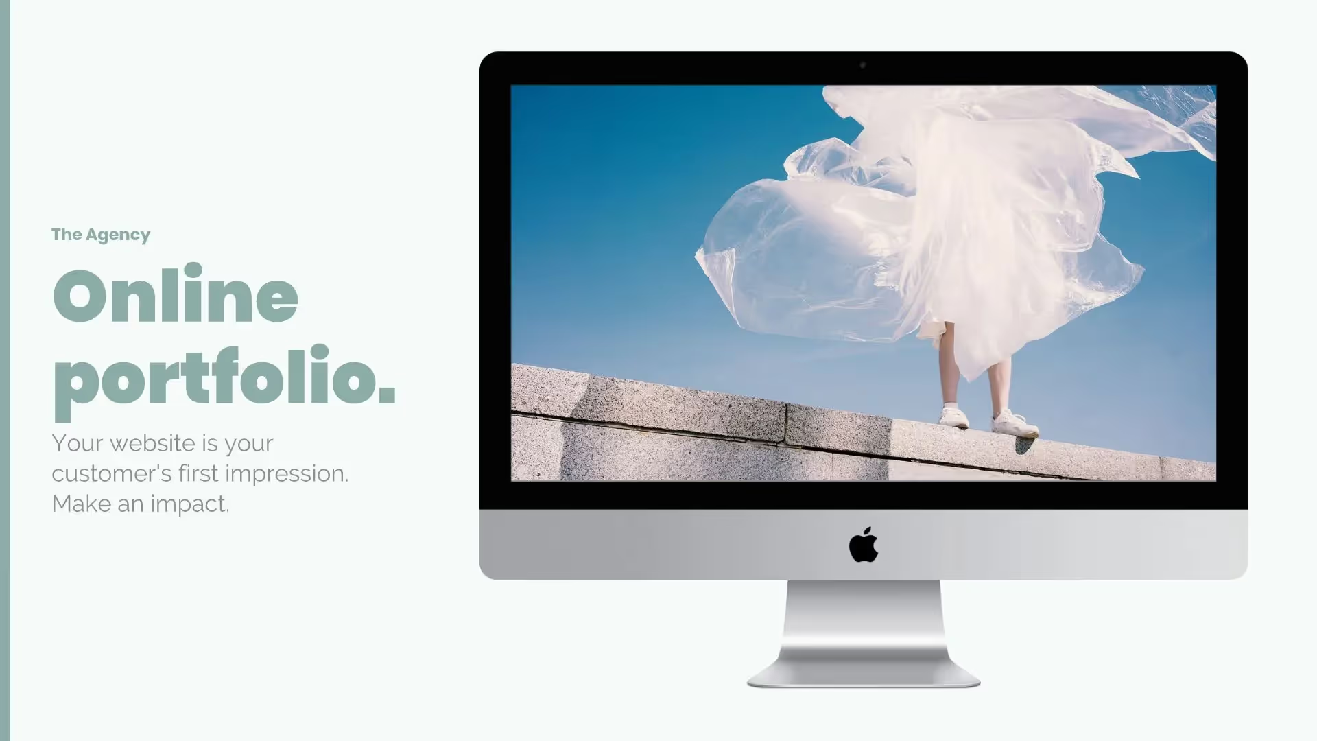
Overview
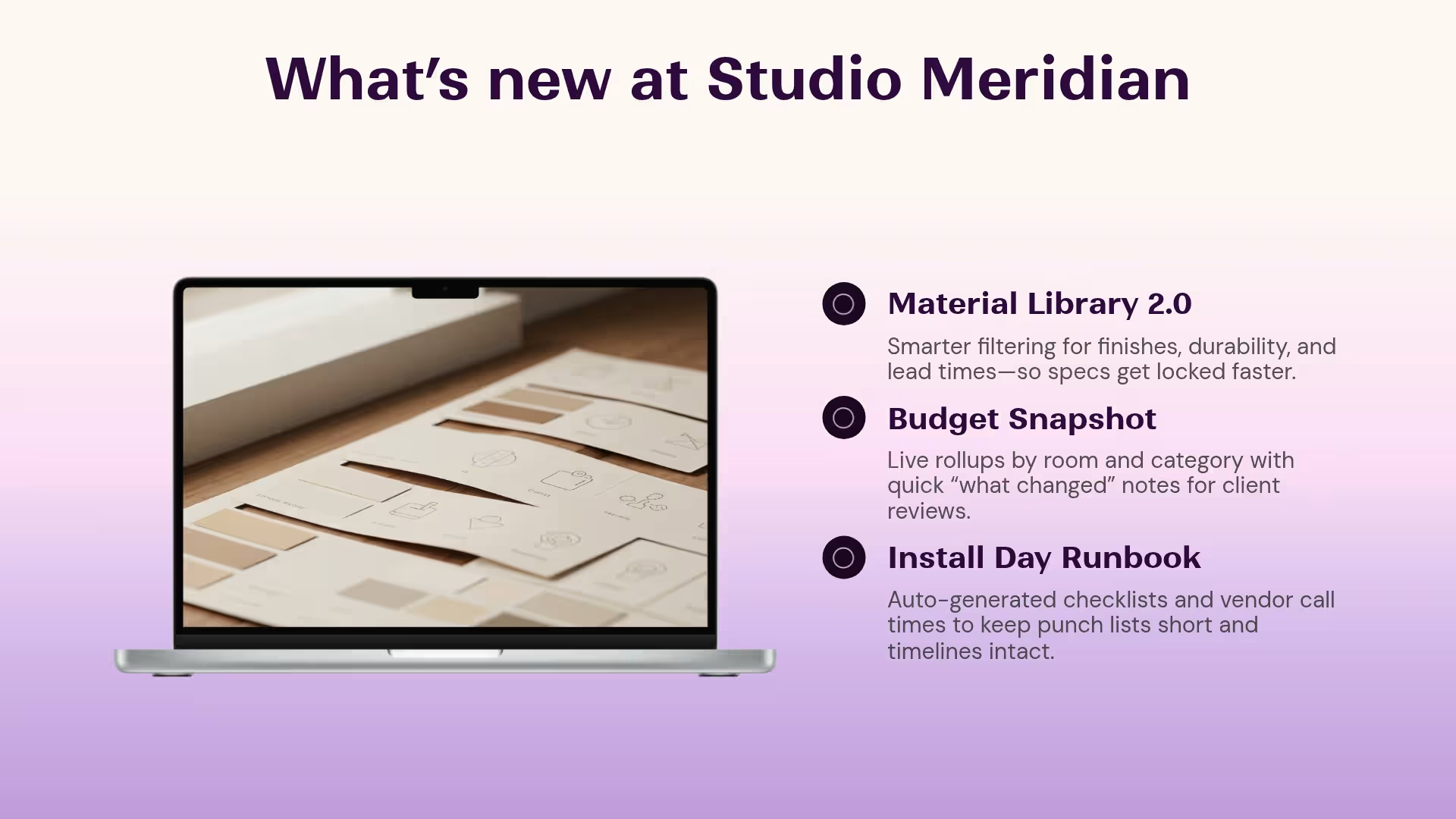
Whether you have a product, service, or website, sometimes you need to share how a client or customer would view it on different devices. But how do you do that in a presentation? Screenshots alone can look messy and don’t always look in-line with your brand. With a desktop template, your presentation can share exactly what users are seeing when they use their desktops to interact with your offer or brand. Our desktop slides allow you to do that easily.
Use the desktop template to:
- See your product through the lens of your customers
- View your website through desktop view
- Highlight a location on a map
Pro Tips for Desktop Slide Templates


Browse more templates
AI-powered Smart Slides that do the design for you
Build your next presentation using Smart Slides—the intelligent building blocks behind every Beautiful.ai presentation. Each Smart Slide is customizable, editable with AI, and automatically adapts layout and spacing as your content changes.
Smart Slides are your built-in designer
Smart Slides auto-align, resize, and animate your content as you edit, so you focus on the message, not formatting.

Start your way, refine with Smart Slides Short heading here
Begin with AI, a deck template, or one slide at a time. No matter how you start, all our presentations are powered by Smart Slides.

Add a designer slide layout
Choose from over 300 Smart Slide layouts for any purpose: data, comparisons, quotes, timelines, image grids, and more.

Edit at superspeed
Add your content and the Smart Slide design logic auto-adjusts spacing, text, and visuals as you edit. Say goodbye to nudging text boxes.

Present & impress
Wow your audience with built-in slide animations, and data visualizations that make your story come alive.
Ready-to-use presentation templates for creating full, polished decks.


Pitch Decks



Reports & Reviews



Plans & Strategies

Try it free for 14 days
Start building Beautiful presentations.


